Google / Android Apps New Features, Tips & Tricks

limmk

High Supremacy Member
Joined
Jul 5, 2001
Messages
43,277
Reaction score
8,349
etQcGCv.png


Key Bug Fixes in Version 10.4
    • System Stability: Fixes an issue where the camera service would occasionally crash, which could bring down the entire phone's operating system (affecting Pixel 6 to Pixel 10a).
    • Zoom Freezes: Resolves a bug that caused the Camera app to freeze when changing zoom levels while actively recording video (affecting Pixel 10 and 10a series).
    • Device Crashes: Patches a specific camera stability trigger that caused system crashes in certain conditions (affecting Pixel 9 and Pixel 10 lines).
 

limmk

High Supremacy Member
Joined
Jul 5, 2001
Messages
43,277
Reaction score
8,349


The Google Pixel camera app is adding new “Quick access” controls on the Pixel 11 series, but it’s a little annoying that not only are they disabled by default, but the way you use them isn’t the most intuitive thing either.

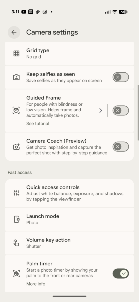
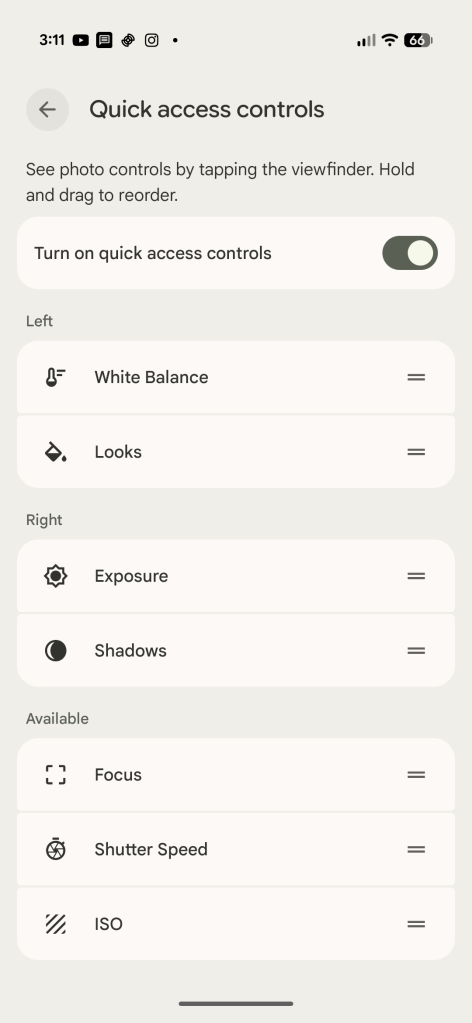
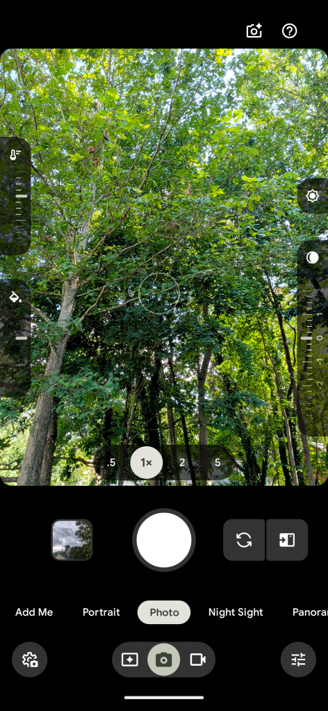
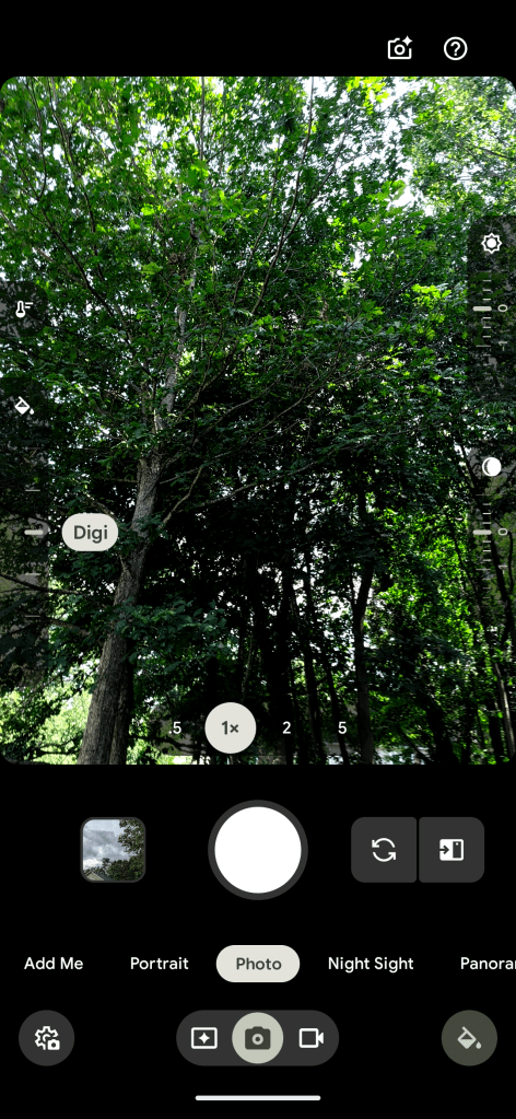
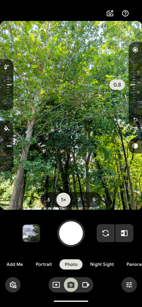
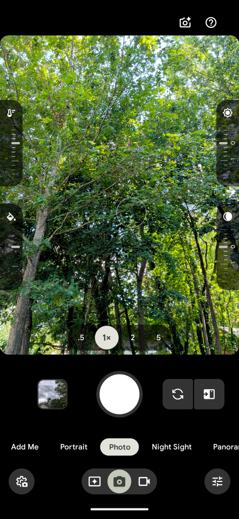
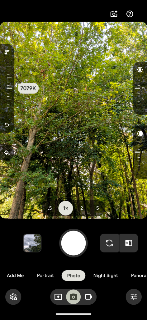
“Quick access” already existed in the Pixel camera app before, arriving back in 2024. But, with the Pixel 11, Google has redesigned the feature. Instead of large slider bars, they appear as slider dials, showing two on each side of the display. These are customizable in layout through the camera settings (found on the overflow button on the setting on the left side of the UI – yes, it’s a bit convoluted) and can include “Looks” on Pixel 11.

Notably, the feature was disabled out of the box on our Pixel 11 devices, but your results may vary.

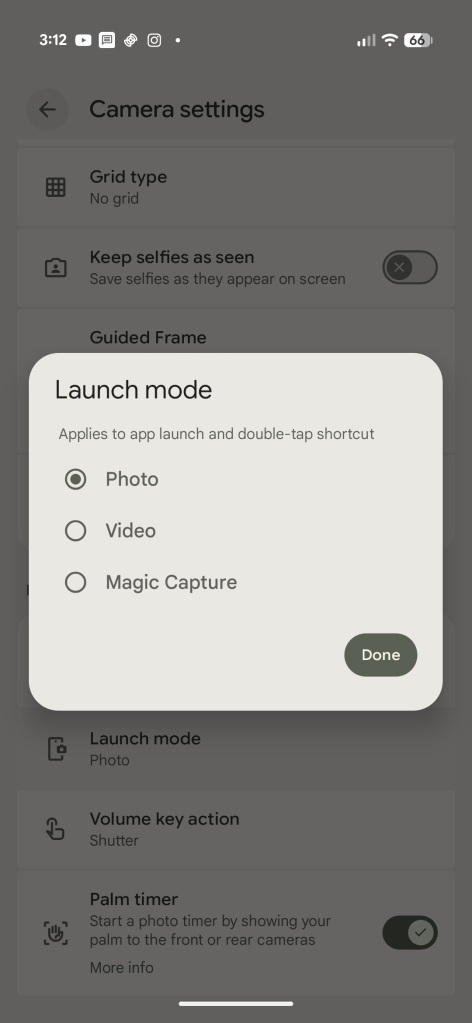
Also new on the Pixel 11 is a “Launch mode” setting, which lets you open the camera app straight to video mode or to Magic Capture. The default is still photo, and this setting appears right next to the slider settings.

Screenshot_20260820-151150.png
Screenshot_20260820-151147.png
Screenshot_20260820-151200.png


Going back to “Quick access,” the sliders themselves aren’t always visible. Instead, you need to tap the screen to get them to show up. A little annoying if you ask me, but also a little unintuitive as there’s no indication these sliders exist until you tap. It’s hard to think of another way this could be implemented, but perhaps a simple toggle to have the sliders show all of the time, maybe even in a condensed state.

Either way, the functionality is simple. Slide up or down to adjust the setting you’ve picked, with an undo button appearing at the bottom once any changes are made. There are no text labels here, but values are shown when changes are
made.

Screenshot_20260820-150205.png
Screenshot_20260820-150218.png
Screenshot_20260820-150201.png
Screenshot_20260820-150145.png
Screenshot_20260820-150151.png
Screenshot_20260820-150142.png


This is yet another UI update debuting on Pixel 11 – ironically in Pixel Camera v11.0 – that we’d expect to show up later on other Pixel devices in one form or another. Existing Pixels are on v10.4.

 

limmk

High Supremacy Member
Joined
Jul 5, 2001
Messages
43,277
Reaction score
8,349


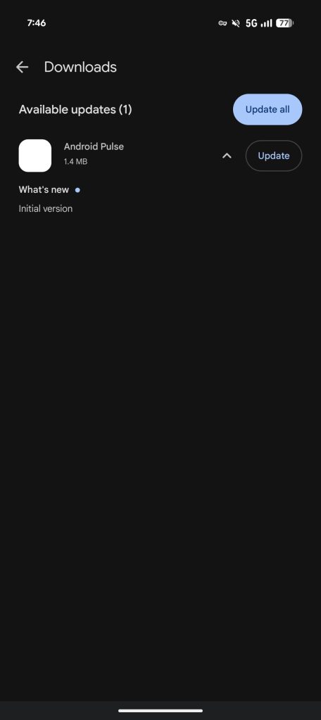
On Saturday morning, you might have noticed an app called “Android Pulse” appearing in the list of available Google Play updates.

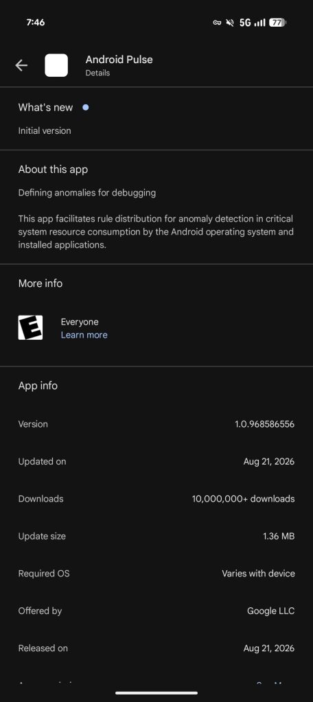
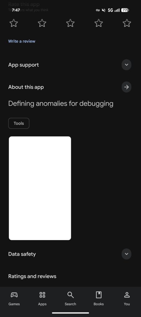
Instead of an application icon, there’s just a blank square. Opening the Play Store listing does reveal it’s a first-party Google app meant for “Defining anomalies for debugging” rather than anything malicious.

com.google.android.apps.pulse

Google adds: “This app facilitates rule distribution for anomaly detection in critical system resource consumption by the Android operating system and installed applications.”

Android-Pulse-Play-Store-1.jpg

Android-Pulse-Play-Store-2.jpg

Android-Pulse-Play-Store-3.jpg

What does Android Pulse do?​

That’s not a very user-friendly description, but our interpretation is that this service — which does not have an interface you can access — helps with software diagnostics for the OS itself and any installed apps. The “critical system resource consumption” could be a reference to battery, CPU, or memory usage.

This application is already installed on our Pixel devices, and it’s just referred to as “Pulse” in system Settings. The App info page also reveals a heart rate-inspired icon in green (as seen in the cover image above).

According to APKMirror, this app has existed since March, with seven previous builds. The Play Store notes over 10 million downloads.

However, today is the first time it appears to have surfaced in the Play Store as an update you can manually install. It’s curious that Google did not use its dedicated System Services approach to update this kind of app.

In short, “Android Pulse” is a Google app that’s okay to have on your phone.
 

limmk

High Supremacy Member
Joined
Jul 5, 2001
Messages
43,277
Reaction score
8,349
TL;DR
  • Google is gradually rolling out a new UI for timers in the Clock app.
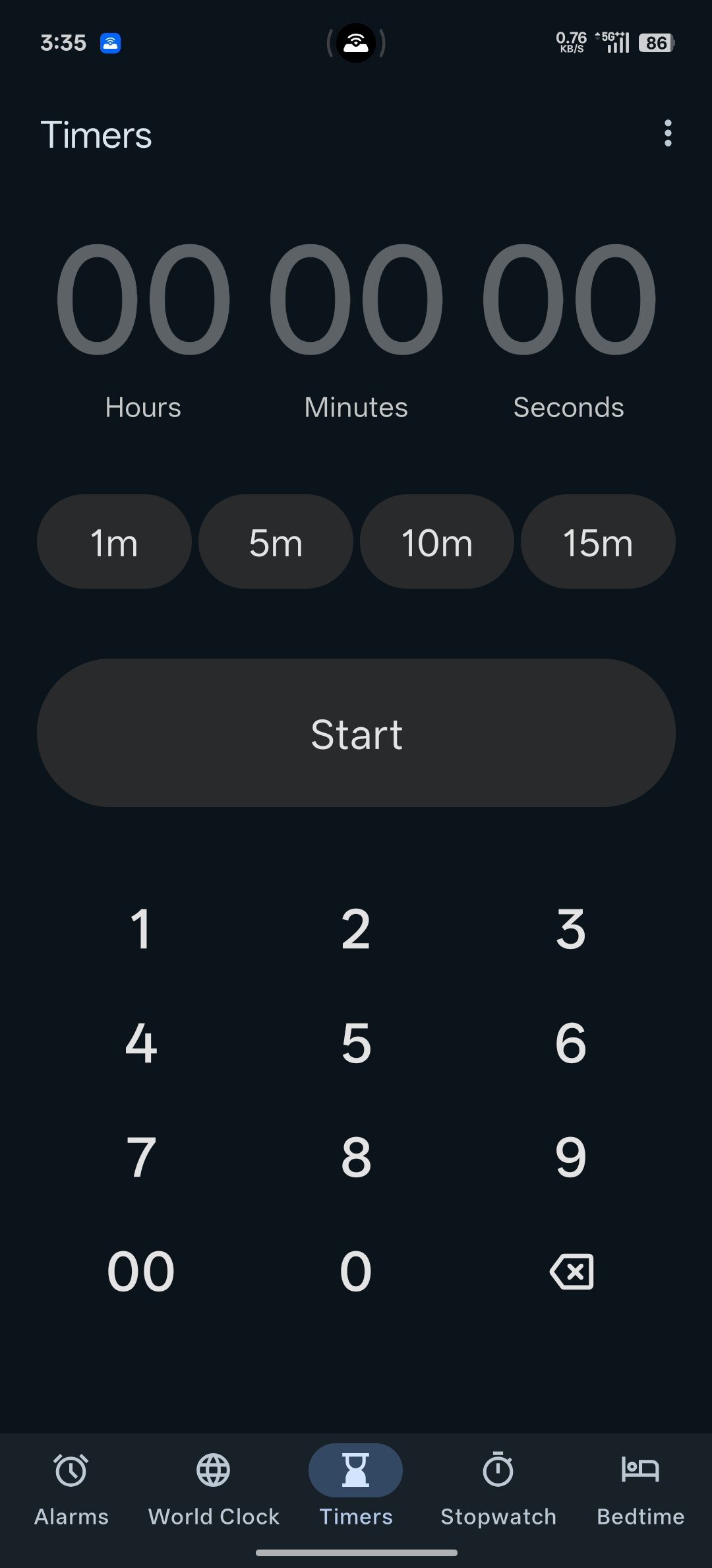
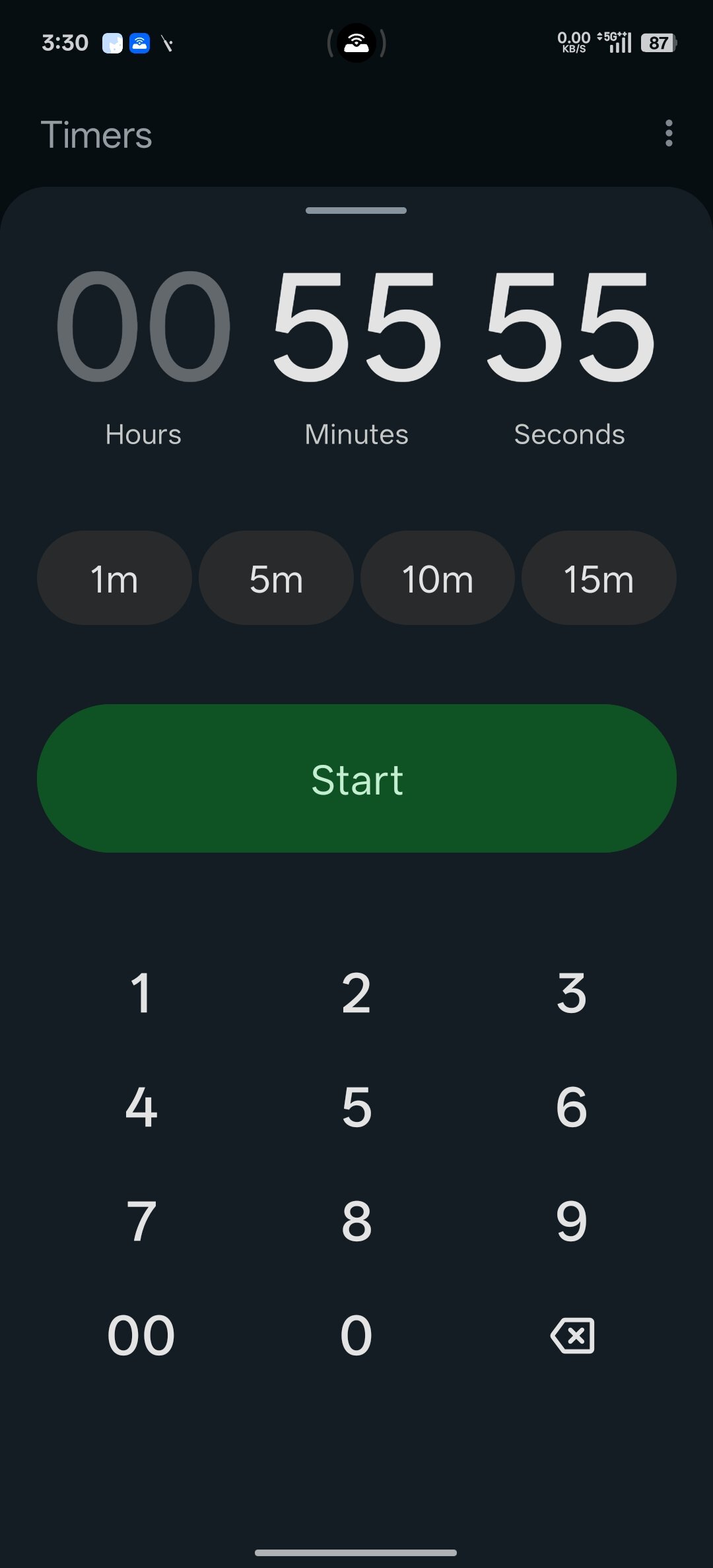
  • The numbers are flatter and come without the circular background; there are presets for 1, 5, 10, and 15 minutes; and the start button has moved.
  • Multiple timers now appear as a grid.


Google has rolled out a few updates as part of the September Android Drop, like Guided Vision for Gemini Live and a crossover between Google Messages and Keep. Not to be missed, the company is also giving the Google Clock app some attention. Specifically, the Timers tab is going to look a little different from how you remember.

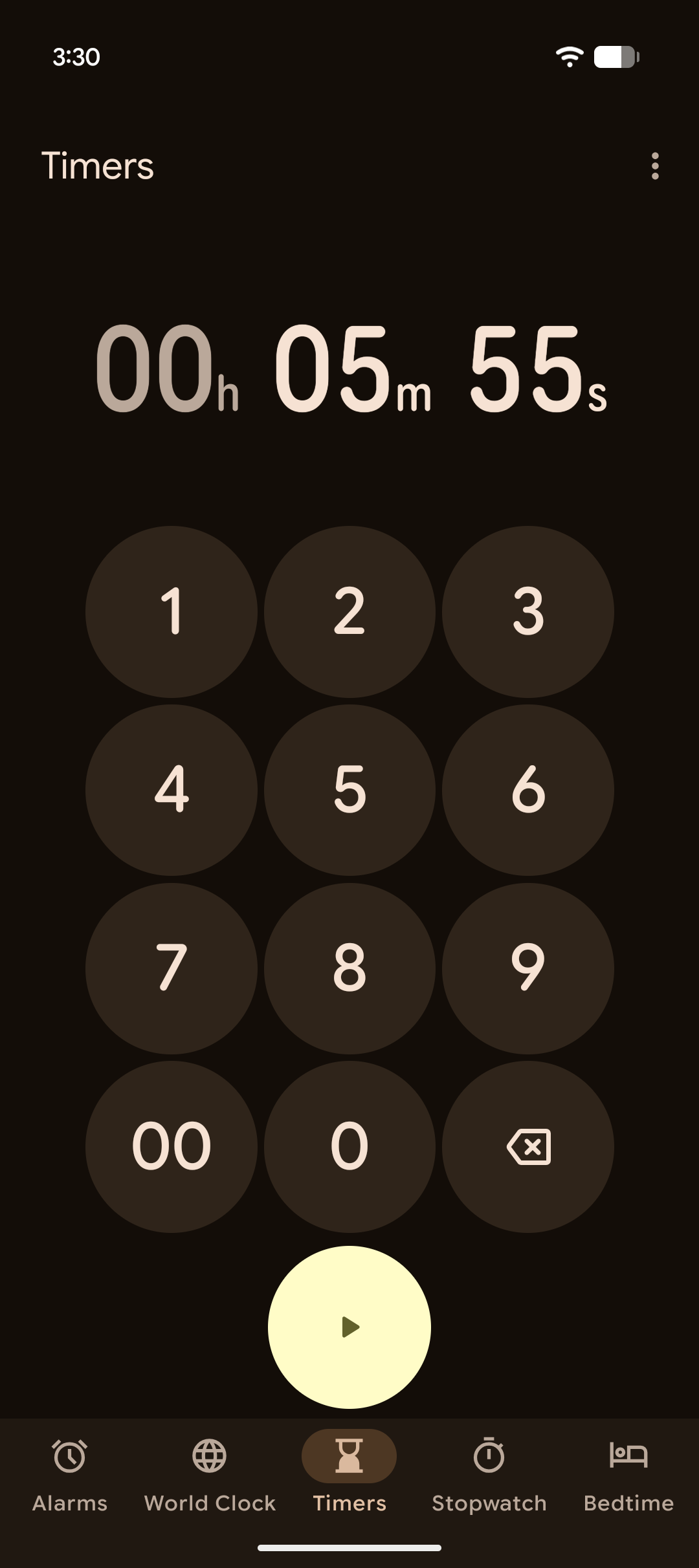
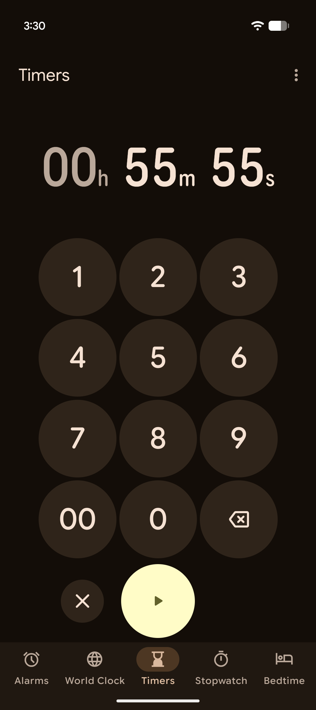
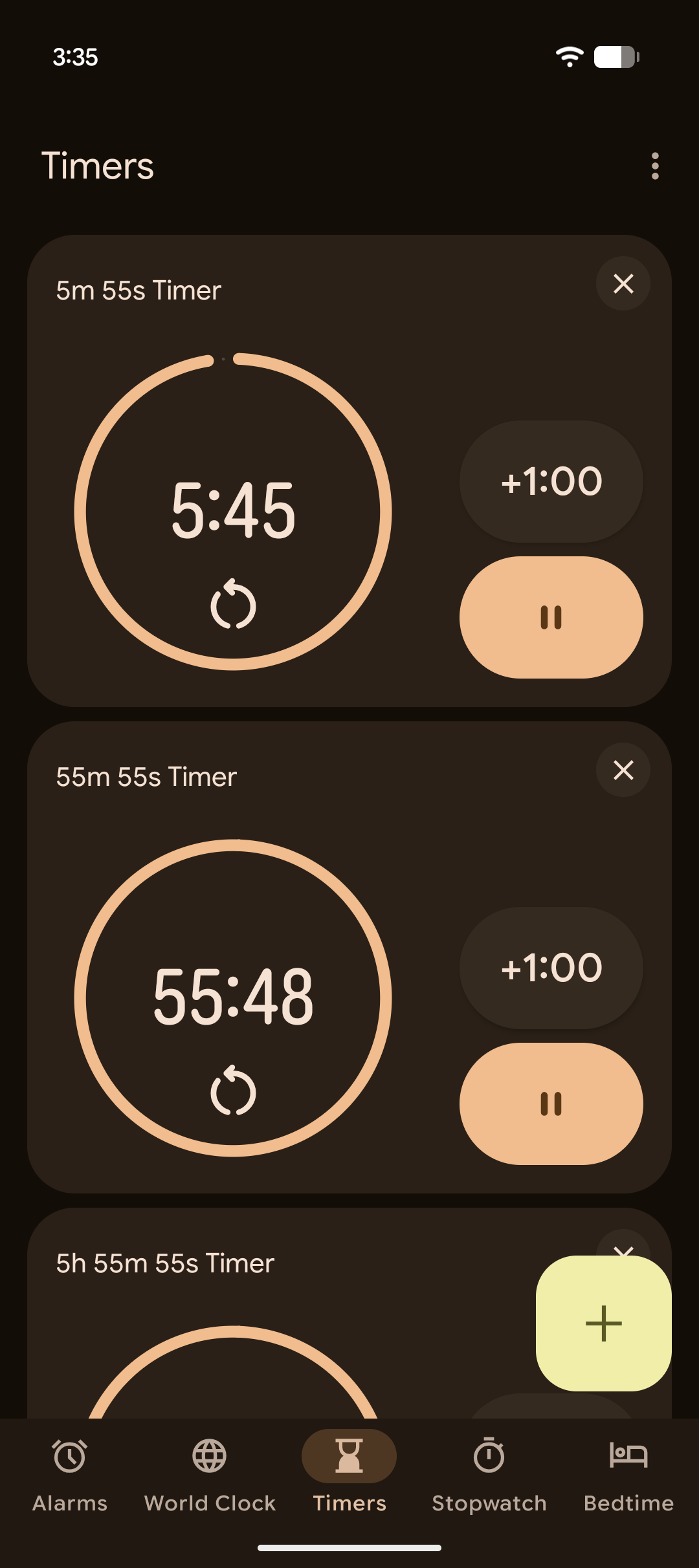
In the UI you’re familiar with, the Timers tab features a large card with rounded numbers. The numbers are also rounded for the numeric keypad overlay, but these numbers are contained in a circular background. If you have more than one timer, this card gains an extra button at the bottom to close it so you can see your other timers. When there are multiple timers, they are arranged in a vertical pattern, allowing you to scroll through them.
Google Clock current timer UI
Google Clock current timer UI 2
Google Clock current timer UI 3


Although your muscle memory may be attuned to the setup above, get ready to retrain it. A new UI is rolling out, and it not only updates the look, but also relocates some buttons and changes how you view multiple timers.

In the images below, you’ll see the new UI Google has prepared for this tab. The numbers are now flatter and sharper than before. You’ll also notice that the numbers in the number pad have lost their circular background. There are now 1, 5, 10, and 15-minute presets near the top. It’s also worth pointing out that the start button now appears above the number pad.

Google Clock new timer UI
Google Clock new timer UI 2
Google Clock new timer UI 3


If you have multiple timers, an “X” button no longer appears on the timer card. Instead, there’s a handle at the top of the card that lets you slide it down to reveal the other timers. The other timers are now arranged in a grid pattern. This should make it easier to see multiple timers at the same time.
 
Important Forum Advisory Note
This forum is moderated by volunteer moderators who will react only to members' feedback on posts. Moderators are not employees or representatives of HWZ Forums. Forum members and moderators are responsible for their own posts. Please refer to our Community Guidelines and Standards and Terms and Conditions for more information.
Top