So far, five Google icons have undergone gradient updates.
9to5Google can now report on a complete gradient redesign for Gmail and other Google Workspace apps.
According to sources familiar with the matter, all Google Workspace apps are getting a big overhaul. There are two overarching themes at play. The gradient effect found in the
Google ‘G,’ Gemini, Home,
Photos, and
Maps is present throughout to reflect the presence of AI-powered features.
Google is addressing a major criticism of the previous icon set by making everything more distinct in terms of color and shape. Last generation’s mandate of including all four company colors in icons is clearly gone. The page container has also been removed for most apps to allow for larger, more unique icons.
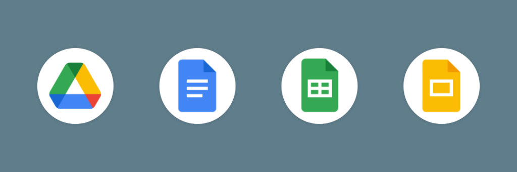
Google Drive
Drive no longer has red, just the classic green, yellow, and blue that match the three editor apps. The exterior is a very rounded triangle that almost feels bulbous, but we find a sharp one at the center.
Google Docs, Sheets, Slides
Like before, Google’s editor apps each use a single predominant color. The Docs icon remains a vertical piece of paper, but Sheets and Slides switch to landscape in a clever reflection of the actual apps.
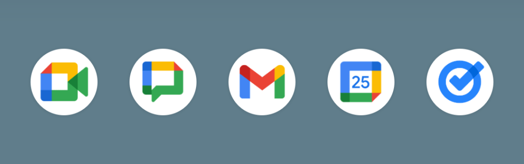
Google Meet and Chat
The video calling app sees a huge departure from the current design. It’s still a video camera, but yellow is the predominant color. Why Google chose that color is not very obvious.
Google Chat sees the same overhaul with a pill-shaped message bubble that has a friendly smile. Green is presumably an homage to Hangouts.
Gmail
The ‘M’ envelope shape of the new Gmail icon is not too different from what we have today, though it’s a little bit more rounded. Red is the predominant color, with only a little bit of yellow, green, and blue. This is the right call and makes the icon much more identifiable and unique. Of the new icons, Gmail is the only one with the four Google colors.
Google Calendar
Calendar noticeably returns to the older icon design with a skeuomorphic reference to the flip-style object. The four-color exterior container is gone, with classic blue returning. It’s absolutely a throwback.
Google Tasks
There’s still a checkmark for Tasks, but the overall container is not very obvious to my eye. It could be a button that you tap when you’ve completed a reminder. Like Calendar, blue is the primary color.
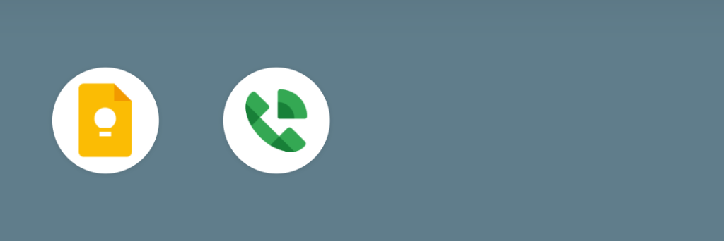
Google Keep
Google has removed the page background to focus on the light bulb, which has quite a bit of detail.
Google Voice
Voice retains the same shape as before, but everything is more rounded. The phone reflects how the app is primarily for calling and business customers rather than consumers. That said, its use of light green matches Google Chat.
Google Forms and Sites
This icon drops the paper motif for multiple choice bubbles, though purple remains the main color.
However, Sites switches from a dark blue to a lighter one, with the horizontal switch reflecting desktop web.