inmyopinion
Arch-Supremacy Member
- Joined
- Jan 15, 2018
- Messages
- 16,358
- Reaction score
- 7,261
So, how much was being spent ?
I didn’t know, but now I do :)how u know my name is margarita? this is my card
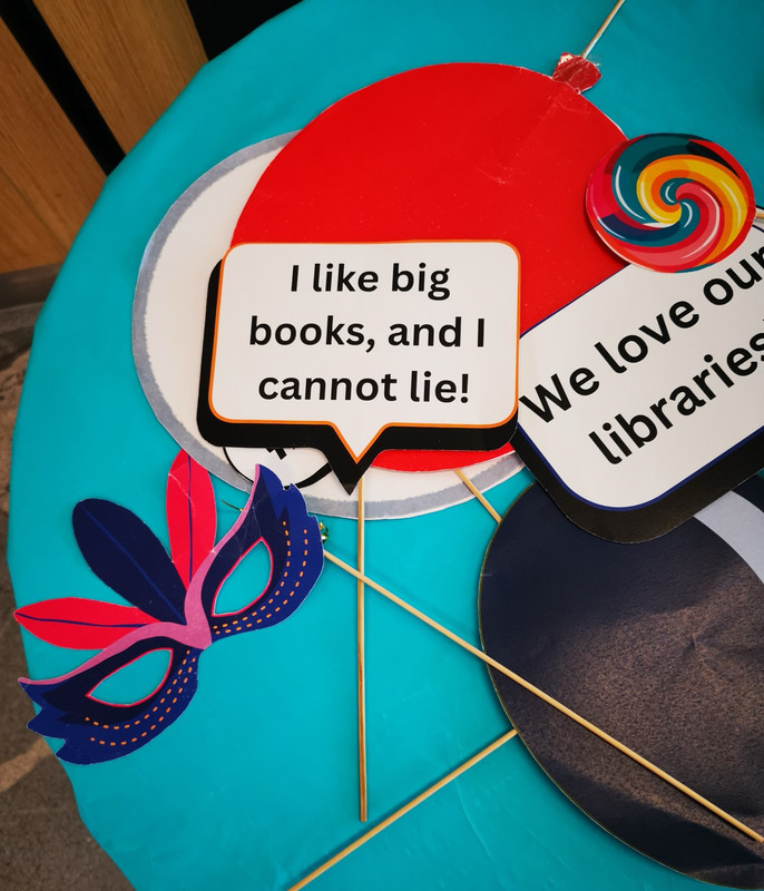
Might as well just call it XX. Cos x and xxx are taken.The National Library Board (NLB) was set up as a statutory board on 1 September 1995 to realise the Library 2000 vision of reinventing the role of libraries then, to promote reading and learning as well as improve information literacy among Singaporeans.
In the early years, we built library after library, introduced digital resources, new services and innovations for easy accessibility and convenience of our patrons. The National Archives of Singapore also joined our family in 2012 to add greater synergy in heritage preservation. Since then, NLB has been inspiring a nation to read and learn. As the chapters in our nation’s story unfold, we have added another element to this, that of discovery, for people to discover new worlds and knowledge.
Today, as ever, NLB remains deeply committed to making reading, learning and discovery accessible and enjoyable to every Singaporean no matter their age or background.
From April 2025, we will start to use a refreshed NLB logo across our physical and digital channels, as well as collaterals. The refreshed logo continues to feature the three coloured “pages and pixels” from the existing logo, with them evolving to symbolise a portal for everyone to step into a familiar yet exciting new world of reading, learning and discovery with NLB.

Evolution of the NLB logo

The three “pages and pixels” of our original logo have evolved into a dynamic blue portal of discovery, inspiring the search for new knowledge and warmly inviting everyone into a familiar yet exciting new world of reading, learning and discovery.
It signals that NLB will continue inspiring discovery through a myriad of platforms with fun and exciting ways to discover and connect.
The continuity with the original logo colours signals our commitment to our patrons, and acknowledges the work of those who came before us as we transform towards a new future.
Our Logo

Our refreshed NLB logo will appear progressively from April 2025 onwards across all our digital and physical channels, libraries, archives, collaterals and other marketing and publicity material.
Brandmark
Our brandmark inspires multiple interpretations. The three coloured panels represent a dynamic portal of discovery and a gateway to new horizons. The interplay of red and orange frames surrounding the blue portal creates multiple perspectives, shaping the viewer’s perspectives.
Logotype
The typography of the logotype uses Fira Sans, a font with rounded edges to align with the brandmark, for a functional yet approachable style. The logotype is in lowercase to invite everyone to engage with NLB as a portal for continuous discovery and opportunities.
Name Style
Over the years, many have come to know and refer to us simply as NLB, the organisation overseeing the National Library, National Archives of Singapore and a network of public libraries. Going forward, we will be happy to be simply called “NLB”! Our mandate to oversee these entities, remains, and we will deliver even more to our patrons and stakeholders through them, to inspire discovery.
Our full name will be changed to the National Library and Archives Board, to reflect that the National Archives of Singapore is part of NLB, but we will only use this when needed. The National Library Board remains the legislated name. In stating it fully as the National Library and Archives Board, we can better share with our stakeholders including partners and international friends our mandate of overseeing our network of public libraries, the National Library, and the National Archives of Singapore, which joined our family in 2012.
Brand Promise
With our logo, we also have a new brand promise “Inspiring Discovery” – which moves beyond books and many other formats and channels and marks our vision for fun and exciting ways for everyone to discover our past, shape our future, and understand ourselves and the world.

NLB is writing our next chapter, and we want you to be part of our story. Join us and step into the portal with us!
https://www.nlb.gov.sg/main/about-us/the nlb brand
I thought it’s a place for old folk to snooze. Should change the logo to Zzz.Still got people borrow books?
West mall library is sibei jialat.After west mall, the next new library is AMKhub.