

You are using an out of date browser. It may not display this or other websites correctly.
You should upgrade or use an alternative browser.
You should upgrade or use an alternative browser.
The Watch Thread - Part 5
- Thread starter hwzadmin
- Start date
- Status
- Not open for further replies.
More options
Who Replied?
a562140
Supremacy Member
- Joined
- Mar 12, 2004
- Messages
- 6,412
- Reaction score
- 3
ok time to break combo and dig out a previous beater. i know many don't like titanium as it picks up scratches easily (but is easily polished off too). but i love it for its rugged finish/patina which matches the tobacco dial perfectly.
titanium is also more resistant to "edge-dings" compared to steel, due to its superior hardness, which will be seen over time.
and unlike steel titanium feels "warmer" to touch so is much more comfortable on hot humid days.

titanium is also more resistant to "edge-dings" compared to steel, due to its superior hardness, which will be seen over time.
and unlike steel titanium feels "warmer" to touch so is much more comfortable on hot humid days.

techead
Senior Member
- Joined
- Aug 14, 2006
- Messages
- 1,594
- Reaction score
- 34
@techead
There, i can't post image or links so i change my avatar to the 57. I can't quote your message either. So troublesome
Haha just joking lah bro.

thats the most water its gonna ever taste.
if it gonna taste anything more i will

Dont say never share. Blue lume but not seiko. Haha.
Hehe nice shot. Bro did u manage to change to rubber strap on your own? Been looking to do it without going to RSC or the AD .
Benedetto13
Member
- Joined
- Sep 10, 2008
- Messages
- 286
- Reaction score
- 0

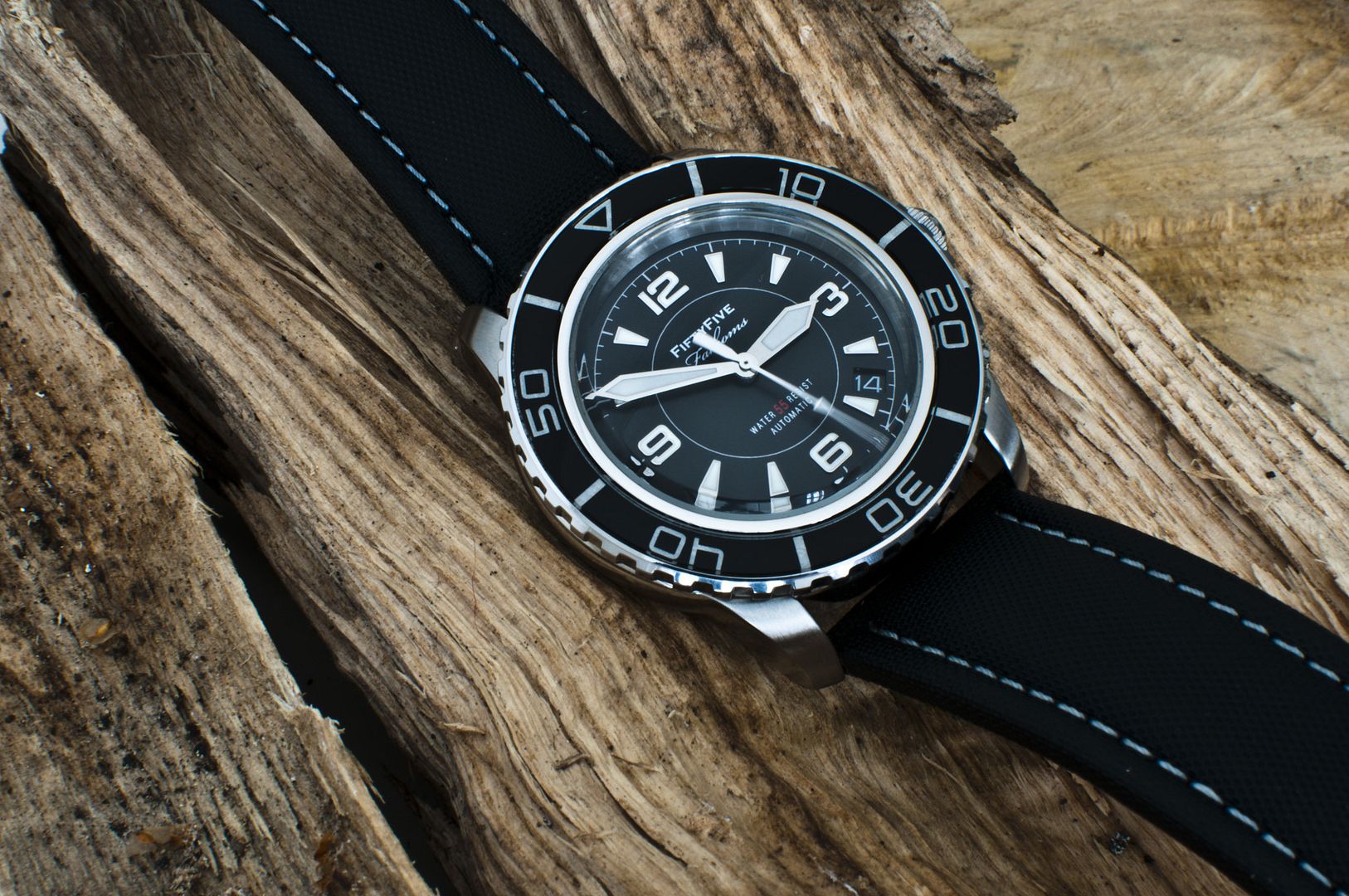
Photo taken off watchh seek.com. Where can I get those hands? I've decided to go with 55 and mod fff.

Azrielsc
Senior Member
- Joined
- Feb 4, 2004
- Messages
- 1,786
- Reaction score
- 19
ok time to break combo and dig out a previous beater. i know many don't like titanium as it picks up scratches easily (but is easily polished off too). but i love it for its rugged finish/patina which matches the tobacco dial perfectly.
titanium is also more resistant to "edge-dings" compared to steel, due to its superior hardness, which will be seen over time.
and unlike steel titanium feels "warmer" to touch so is much more comfortable on hot humid days.
Is that a Pam 240 with a tobacco dial?
And yes, a titanium casing does help "hide" scratches! Just need a glass fibre scratch remover pen and you are golden, or in your case, TITANIUM!
Last edited:

chickenbackside
Senior Member
- Joined
- Jan 7, 2008
- Messages
- 2,292
- Reaction score
- 0
Makes me wanna go buy another one in silver to mod to this one...
OH
MY
GAWD
Benedetto13
Member
- Joined
- Sep 10, 2008
- Messages
- 286
- Reaction score
- 0
Makes me wanna go buy another one in silver to mod to this one...
Want buy dial and strap together to mod?

Emospence
High Supremacy Member
- Joined
- Mar 19, 2012
- Messages
- 38,419
- Reaction score
- 48
OH
MY
GAWD
Odd, most pics I've seen of the modern FF mod doesn't look this good
chickenbackside
Senior Member
- Joined
- Jan 7, 2008
- Messages
- 2,292
- Reaction score
- 0
Quite simple lah.What do I need to get to achieve this? I need a SNZH55. Just another dial from the hongkong? And for the strap?
Just the watch and the dial from Dagaz (US$35 including shipping). The strap Mr Goh has.
Emospence
High Supremacy Member
- Joined
- Mar 19, 2012
- Messages
- 38,419
- Reaction score
- 48
yea, i heard its abt a day too. thts why im still hesitating to get it
anyways my seiko cocktail hav arrived. Its awesome except for the strap.
Why leh? Too tough?
Where the pics?!?!
Emospence
High Supremacy Member
- Joined
- Mar 19, 2012
- Messages
- 38,419
- Reaction score
- 48

So what do you guys think about which dial looks better?
My thought process:
Yobokies -
1) cleaner look without the numbers since there are already 5 numbers on the bezel
2) option of no date, which I prefer
3) the black bay style indices don't really gel with the style of the watch
4) the proportion of the bezel font size to the indices are a bit off, making the bezel look slightly oversized
Dagaz -
1) the numbers on the dial makes the watch look a bit too busy with 2 sets of prominent numbers
2) I prefer the indices here as the are longer and make the watch look more balanced
3) I cannot delete the date
What is a man to do?
One vintage homage, one modern homage.
GET BOTH
chickenbackside
Senior Member
- Joined
- Jan 7, 2008
- Messages
- 2,292
- Reaction score
- 0
I gotta study a lot more photos of this combination.Want buy dial and strap together to mod?
From what I have seen so far, this particular picture has special mojo that make it look better than it actually is...
Benedetto13
Member
- Joined
- Sep 10, 2008
- Messages
- 286
- Reaction score
- 0
I gotta study a lot more photos of this combination.
From what I have seen so far, this particular picture has special mojo that make it look better than it actually is...
The bezel seems a little odd..
chickenbackside
Senior Member
- Joined
- Jan 7, 2008
- Messages
- 2,292
- Reaction score
- 0
That's the thing. It's cheap enough to consider, and that's a dangerous thing.One vintage homage, one modern homage.
GET BOTH
I can already foresee that I will like one more than the other and wear it more often, but in the scheme of things, it will ultimately still receive limited wrist time in the rotation.
So cheap isn't so cheap.
One vintage homage, one modern homage.
GET BOTH
Vintage for me! Maybe that's why I like my BB so much

chickenbackside
Senior Member
- Joined
- Jan 7, 2008
- Messages
- 2,292
- Reaction score
- 0
What I find inaccurate is the dial looks bigger than usual, and the thickness of the bezel thinner than usual, making it more proportionate than it really is.The bezel seems a little odd..
Just compare the pics of the same watch on this page. The one I posted looks a lot busier although it's exactly the same combo.
Azrielsc
Senior Member
- Joined
- Feb 4, 2004
- Messages
- 1,786
- Reaction score
- 19
Quite simple lah.
Just the watch and the dial from Dagaz (US$35 including shipping). The strap Mr Goh has.
CBS, you damn poisonous lah!
- Status
- Not open for further replies.
Important Forum Advisory Note
This forum is moderated by volunteer moderators who will react only to members' feedback on posts. Moderators are not employees or representatives of HWZ Forums. Forum members and moderators are responsible for their own posts.
Please refer to our Community Guidelines and Standards and Terms and Conditions for more information.
