Google / Android Apps New Features, Tips & Tricks

limmk

High Supremacy Member
Joined
Jul 5, 2001
Messages
41,216
Reaction score
8,166
TL;DR
  • Google Lens offers a powerful image-based tool for conducting searches.
  • Right now, when accessing results that search bar lives at the top of your screen.
  • Google’s experimenting with a new bottom layout that could make it easier to use one-handed.


If you’re not already regularly using Google Lens, you are probably missing out on quite a lot, as the image-based search tool has a fascinating ability to open up the world around us. Out for a walk and curious about the trees lining the path? A quick lookup with Lens can make you feel like an amateur arborist in seconds. Spontaneous use cases like that really benefit from an app that’s as easy to use as possible, and today we’re checking out one in-development change that could add a little bit of help in exactly that direction.

Google recently updated its Android app to version 16.22.44.sa.arm64 beta, and we’ve been putting it through its paces to check for any interesting changes. When it comes to Google Lens, we identified one in particular that slightly modifies the service’s search interface.

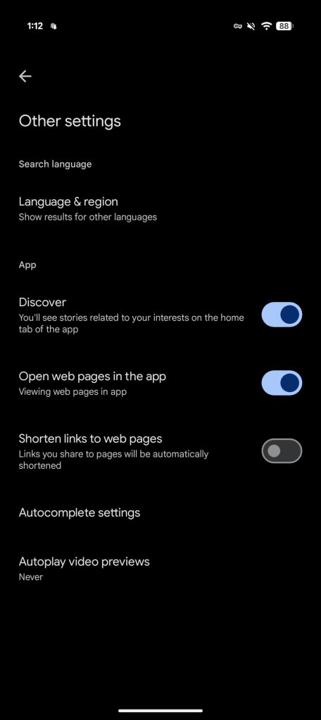
Right now, after you access an image in Lens, the app pulls up a search card from the bottom, and you can swipe up to fill the screen. But as you do so, your search bar keeps right on moving up, too, and ends up perched along the display’s top edge.


While that makes it easy to see at a glance, it’s also not in the easiest-to-reach place for refining your search, especially if you’re trying to use your phone one-handed. And with the sort of casual, spontaneous usage situations that Lens can really enhance, it’s easy for us to appreciate how being able to quickly work one-handed could be a real improvement. To that end, we’ve been able to activate a preview of a modified UI for Lens that moves this bar to the bottom.

Currently this bottom-search-bar interface is not yet publicly visible in Lens, even with the Google app’s beta release. And for all we know, Google’s just kicking the tires on this tweak, and may never end up making it the official Lens UI. Do you think it should, though? Tell us if you’re a top-bar or bottom-bar fan down in the comments.
 

limmk

High Supremacy Member
Joined
Jul 5, 2001
Messages
41,216
Reaction score
8,166
TL;DR
  • The Google app on Android could soon receive some subtle design tweaks.
  • We’ve spotted upcoming tweaks for the status bar, search progress bar, and the tab bar at the bottom in the latest beta release.
  • The app could also receive a new Material 3 Expressive loading animation and a button to refresh the feed.


The Google app on Android is set to receive some visual changes in line with Android’s new Material 3 Expressive design language. We’ve spotted these changes in the latest beta release (version 16.22.44), and here’s an early look at the upcoming design improvements.

Starting at the top, the status bar in the Google app has received a translucent gradient background. It gives the status bar a more modern look and is already live in the latest beta release. It’s a very subtle change, and you may not even notice it if you’re using the dark theme on your phone, but it’s more apparent when using the light theme.

Google app screenshots showing new translucent status bar background 2
Google app screenshots showing new translucent status bar background 1


Google is also working on a minor tweak for the progress bar that appears under the Search bar when you perform a search. The updated design is slightly thicker and more rounded, as shown in the following screenshot.

Screenshot of updated progress bar in the Google app


Lastly, Google is updating the scroll behavior of the tabs at the bottom of the screen. Currently, the tabs remain persistently visible as you scroll through the app. However, in a future release, Google plans to change this behavior and hide the tabs when you scroll through the feed.


The attached clip shows this new behavior and gives us a glimpse of the new Material 3 Expressive loading animation that will appear when you reach the bottom of the feed. The clip also shows a new “Refresh” button that appears under the search bar as you scroll through the feed, but it’s not functional in the current beta release.
 

limmk

High Supremacy Member
Joined
Jul 5, 2001
Messages
41,216
Reaction score
8,166
TL;DR
  • Google is discontinuing its Android Instant Apps feature in December 2025.
  • The feature allowed users to try parts of an app without needing to perform a full installation from the Play Store.
  • Low developer adoption is the likely reason for the shutdown, as creating the small, instant-enabled app versions required a lot of work.


There are many different ways to interact with a digital service, but the average smartphone user tends to prefer using a mobile app over a website. However, installing a new app every time you want to try a service can be a hassle, which is why Google created the Android Instant Apps feature. Android Instant Apps allow users to try parts of a mobile app without fully installing it, speeding up content delivery, reducing data and storage use, and providing a more optimized mobile experience. The feature was rarely implemented by developers, though, so Google is discontinuing it by the end of 2025.

Google announced the Android Instant Apps feature back in 2016 and began rolling it out to users in early 2017. The way it works is that when you tap on a link, the Google Play Store checks if an instant app exists and runs it without installation. Instant apps are kept on your device temporarily and take up much less space than the full versions of the apps available on the Play Store.

Here’s a demo of the Android Instant Apps feature featuring Ilta-Sanomat, a prominent Finnish evening newspaper:


Companies like Vimeo and Wish were some of the earliest to use Android Instant Apps, allowing them to acquire new users by getting their apps in front of people casually browsing the web.
While the format seems like an obvious win for developers and users, supporting it isn’t trivial. Developers must create a special “instant-enabled” version of their app that is under 15MB, allowing it to be pushed to a user’s device almost seamlessly. Trimming an app down to this size can be difficult, especially for those with large, complex dependencies. This difficulty may be why few developers added support for Android Instant Apps over the years and is likely why Google is comfortable shutting the feature down.

While using the latest canary build of Android Studio, developer Leon Omelan spotted a notice when hovering over the Instant Apps dependency. This notice reads as follows: “Instant Apps support will be removed by Google Play in December 2025. Publishing and all Google Play Instant APIs will no longer work. Tooling support will be removed in Android Studio Otter Feature Drop.” Android Authority can confirm this notice is present in Android Studio, as shown below.

Google killing Instant Apps in Android


Google hasn’t updated its online documentation yet to reflect the winding down of Android Instant Apps, but we imagine this notice will be published elsewhere soon. Since few developers used the feature anyway, most users probably won’t notice it’s gone.
 

limmk

High Supremacy Member
Joined
Jul 5, 2001
Messages
41,216
Reaction score
8,166


Google today surprisingly released a major 3.0 update for Snapseed that entirely redesigns the photo editing app on iPhone and iPad.
Given the lack of major updates in several years, it seemed that Google abandoned Snapseed. Since the app worked locally and has no server-side component, it seemed like the company was happy to let the beloved editor linger. The last notable update to Snapseed for iOS was in 2021, with very minor updates in 2023 and 2024.

Google today released version 3.0.0 of Snapseed, while noting how “some new things [are] sprouting around here.” There’s also a simplified app icon:
Old vs. new

old-Snapseed-logo.webp

new-Snapseed-logo.webp


There’s a brand new interface that shows photos you’ve edited in a grid. To start editing, tap the circular ‘plus’ FAB (floating action button) at the bottom of your screen.

Snapseed-3.0-update-1.webp
Snapseed-3.0-update-2.webp
Snapseed-3.0-update-3.webp


The editor is organized into three tabs: Looks, Faves (new), and Tools. Export has moved to the top-right corner. That middle tab lets you save tools for quick access, while everything is available from that last tab. Available tools include:
  • Adjust & Correct: Adjust, Details, Tonality, Curves, White Balance, Lens Blur, Vignette
  • Retouch & Transform: Selective, Brush, Healing, Portrait, Crop, Perspective, Expand, Head Pose
  • Style: Film (new), Glow, Retrolux, Vintage, Black & White, HDR Scape, Drama, Noir, Grunge
  • Creative: Double Exposure, Frames, and Text
Original interface
old-Snapseed-ui-1.jpg
old-Snapseed-ui-2.jpg
old-Snapseed-ui-3.jpg


As always, you drag left/right to make value adjustments, but you now get an arc-based controller at the bottom. In certain tools, you can still swipe up/down to access different options.
There’s also a “More to come, stay tuned” teaser. It remains to be seen if this Snapseed 3.0 update is coming to Android.
 

limmk

High Supremacy Member
Joined
Jul 5, 2001
Messages
41,216
Reaction score
8,166
TL;DR
  • An Android Authority teardown has revealed that the Pixel Camera app will receive a redesign.
  • The redesign currently extends to the settings menu and offers an overhaul in line with the Material 3 Expressive design language.
  • This comes after we discovered a slew of other Google apps with an overhauled visual style.


Google just launched Android 16, but the platform’s big visual overhaul based on Material 3 Expressive is coming later this year. That hasn’t stopped us from uncovering redesigned Google apps, and we’ve now got our first peek at the tweaked Pixel Camera app.

We conducted a teardown of the Pixel Camera app (version 9.9.106.767010485.16) and discovered an overhauled settings menu. These changes aren’t live yet, but we enabled them nonetheless. Check out the screenshots below.

Google Pixel Camera M3E AssembleDebug 1

New UI

Google Pixel Camera M3E AssembleDebug 2

New UI

Google Pixel Camera M3E AssembleDebug 3

New UI

Google Pixel Camera app current UI 1

Current UI

Google Pixel Camera app current UI 2

Current UI

Google Pixel Camera app current UI 3

Current UI

This redesigned settings menu features redesigned toggles, complete with a tick or “x” so you can easily tell whether an option is on or off. Settings are also placed in white boxes with rounded corners, while lines divide multiple settings in one box.

This is all in line with Google’s new design language, but we’re guessing the app will see further tweaks ahead of Android 16’s Material 3 Expressive release later this year. This isn’t the only change spotted in the Pixel Camera app, as it looks like Google removed the Social Share shortcut as well.

The Pixel Camera changes also come after we uncovered redesigns for various other Google apps, including Google Meet, the Phone app, Gmail, and the Google app.
 

limmk

High Supremacy Member
Joined
Jul 5, 2001
Messages
41,216
Reaction score
8,166


Google is testing a new launch animation for the Gemini overlay with Android 16 QPR1 Beta 2. It also suggests the missing vibration is just a bug.

With Beta 2, the “Press & hold power button” gesture to launch Gemini stopped vibrating. The haptic feedback when accessing the Power menu remains, so this is most likely a bug for the Digital assistant option.

Google is now testing a new launch animation for the Gemini overlay. For users that have this A/B test, the vibration is back. Upon activation, your current screen starts to shrink.

When the black borders (which come in from all sides) reach their farthest point, the Gemini overlay starts to slide up with Share screen with Live, Ask about screen, and the Ask Gemini field, with its usual animation. At the same time, the window returns to its fullscreen interface and you can ask your question.


It looks nice on a device (and is completely smooth compared to the hard edges that briefly appear in the screen capture above), with the intended visual effect being how the physical borders of your display are shrinking. This is not widely rolled out and only appearing on one of our Pixel devices.

Besides this Gemini launch animation, Android 16 QPR1 Beta 2 is also A/B testing a redesigned Pixel Launcher search field with AI Mode. It disappeared across all of my devices on Friday, but the new gradient ‘G’ logo is still there.
 

limmk

High Supremacy Member
Joined
Jul 5, 2001
Messages
41,216
Reaction score
8,166


Google is rolling out a small update to the Clock app — version 7.14 — on Android that makes a pair of visual tweaks. It follows the last release in April.

Throughout the app, Google Clock 7.14 uses the latest Material 3 switches. These on/off toggles have the same general shape, but are slightly taller and narrower. The off state features bolder outlines and a less prominent circular handle. (Developers have the optional ability to add checkmark or ‘x’ icons inside the circle, like Google Wallet settings.)

In the Clock app, you’ll find these updated switches in the Alarm tab and Settings list.

These components are a few years old (2022) at this point, but adoption in first-party apps has been slow. With Material 3 Expressive, Google did not update this component.

Old vs. new

Google-Clock-7.13-old-1.jpg
Google Clock 7.14
Google Clock 7.14


Meanwhile, the (world) Clock tab features an updated weather condition icon set. Instead of being traditionally colored (like a yellow sun), everything is now gray. It’s a more subtle look that can be less distracting, though it doesn’t stand out as much compared to before when you are quickly skimming the list.

Google Clock 7.14 is slowly rolling out via the Play Store and not yet widely available.

Google-Clock-7.13-old-2.jpg
Google Clock 7.14
 

limmk

High Supremacy Member
Joined
Jul 5, 2001
Messages
41,216
Reaction score
8,166


Following the announcement in early June, Google is more widely rolling out Scheduled Actions to the Gemini app on Android.

Scheduled Actions let you run a prompt at a specific time, day, date, or after an event. To create, just “provide details about when and how often you want to schedule the action” in the command.

Gemini will confirm the Scheduled Action and automatically enable it. The inline card shows a “Pause” button.

To manage in the future and see everything you’ve created, tap your avatar in the top-right corner for the profile menu. There’s a new “Scheduled actions” item between “Apps” and “Gem manager.”


Gemini app Scheduled Actions Android


This page lists all your actions and when it’s scheduled, with the “Pause” button and “Delete” behind the overflow menu.

You can “have up to 10 active scheduled actions at a time.” Scheduled Actions with location will “use the location where you created the action for all future responses.”

Example use cases include:

  • Daily summaries of your calendar, to-do list, and unread emails for the day ahead.
  • Daily updates on the weather and outfit ideas based on a list of wardrobe items that you give Gemini.
  • Weekly news updates or details about upcoming events for your favorite artist.
  • Weekly rollups of new local cafes and restaurants to check out during the weekend.
  • …get a creative boost by having Gemini write five ideas for your blog every Monday
  • …schedule a one-off task like asking Gemini to give you a summary of an award show the day after it happens
As of today, we’re seeing Gemini’s Scheduled Actions more widely rolled out on Android for AI Pro and AI Ultra subscribers. Force stop from App info (version 16.23 beta). We’re not seeing it in the iOS app or gemini.google.com.
 

limmk

High Supremacy Member
Joined
Jul 5, 2001
Messages
41,216
Reaction score
8,166


Last week, a “Magic Cue” capability for the Pixel 10 leaked, and Gboard today revealed upcoming “Pixel Sense” integration.

Pixel Sense​

The latest Gboard beta (version 15.5) features strings about how you can “Finish tasks faster with Pixel Sense.”

[Pixel Sense] brings your info to you, with no need to search

Pixel 10 Magic Cue
Pixel 10 Magic Cue


A previous Pixel 10 leak referred to the predictive suggestions capability as “Pixel Sense,” with Google seemingly renaming it to Magic Cue. Whatever the name, this feature can surface answers on your screen by looking at Gmail, Calendar, Keep, Tasks, Contacts, Messages, and Screenshots. The example Google offered was a friend asking for your flight number in a chat and Magic Cue finding it from Gmail for quick sharing.

With last week’s leak, it was unclear what the interface for this will be. Today’s mentions in Gboard suggest that it will appear in the suggestions row for a quick paste. This is exactly like the Pixel Screenshots “recall” integration introduced in December.

If you take a screenshot that includes a movie, song/album, or product, Pixel Screenshots will remember that information when you open an app where that information will be useful.

If somebody messaged me a Now Playing screen (e.g. “check this out”) and I saved it to Pixel Screenshots, opening YouTube Music or Spotify gives me a Gboard autofill suggestion for the name of that song.

Pixel-Screenshots-Gboard-recall-2.jpg
Pixel-Screenshots-Gboard-recall-3.jpg
Pixel-Screenshots-Gboard-recall-4.jpg
Pixel-Screenshots-Gboard-recall-5.jpg

Smart Edit​

Gboard is also working on a feature that lets you make voice edits: “SmartEdit helps you add, remove, or replace words easily with just your voice.”

“To apply your edits, your editing commands and text that\u2019s edited will be sent to Google and temporarily processed. No audio or voice data is sent.\n\nYour use of the SmartEdit feature in Gboard is subject to the “Generative AI Terms of Service”. To learn how your data is handled, visit the\n”Google Privacy Policy.
 

limmk

High Supremacy Member
Joined
Jul 5, 2001
Messages
41,216
Reaction score
8,166


Following last week’s announcement, Google Messages is widely rolling out features like “Snooze notifications” and “Delete for everyone” to the stable channel.

From the app’s homepage, long-pressing on a conversation reveals a new Snooze icon. The clock appears between pinning and archiving at the top.

Tapping brings up the “Snooze notifications” panel: “Other members will not see that you snoozed this chat.” There are four increments: 1 hour, 8 hours, 24 hours, and Always. After doing so, the conversation will be grayed out with a snooze icon underneath the time/date. To undo, long-press and hit the clock icon again.

Google-Messages-snooze-notifications.jpg
Google Messages delete everyone

Meanwhile, when you’re in an RCS conversation, you can long-press on a sent message and tap the trash button for two options:

  • Delete for everyone: Messages may still be seen by others on older app versions
  • Delete for me
This finally matches the behavior of modern messaging services.

In addition to renaming RCS group chats, there’s the option to change the 2×2 circular grid of profile avatars to a custom icon. You can upload your own image or pick from Google Illustrations.

Finally, the New chat page now shows RCS status with a label at the right and Dynamic Color theming for stable users (version 20250528_00_RC00).

Google-messages-custom-group-chat-icons-1.jpg

Google-messages-custom-group-chat-icons-2.jpg
 

limmk

High Supremacy Member
Joined
Jul 5, 2001
Messages
41,216
Reaction score
8,166


The Phone by Google app is getting an all-encompassing Material 3 Expressive redesign that also adds “Horizontal swipe” or “Single tap” options for answering calls. Like Google Messages, this is beginning to roll out to the beta channel.

There’s no change to the four-tab bottom bar (though the background is now darker) or “Search contacts” field.

The Recents tab sees all calls placed in rectangular cards with rounded corners. As always, you can tap to see the various number options. This container change is present throughout the app, including in Favorites and on the dialer screen. The number pad is unchanged, but the background sheet now features rounded corners.

Google Phone Material 3 Expressive

Google Phone Material 3 Expressive


The All, Missed, Contacts, Non-Spam, and Spam filters have also been refreshed. They are no longer outlines.

The main Settings list also makes use of Material 3 Expressive, while there’s a new “Incoming call gesture” menu with “Horizontal swipe” and “Single tap” options. That incoming screen makes use of the scalloped Material 3 shape and rotates until you take action. “Urgent?” and “Message” are housed in pill-shaped containers.

Google Phone Material 3 Expressive


On the live call screen, the circular buttons make way for pills that morph into rounded rectangles when selected, as well as updated spacing. The end call button is also now a pill that’s much wider and more prominent.

This Material 3 Expressive redesign is rolling out with beta version 180 of Phone by Google. It’s not yet widely available and involves a server-side update.

Google-Phone-Material-3-Expressive-redesign-11a.jpg
Google-Phone-Material-3-Expressive-redesign-12.jpg
Google-Phone-Material-3-Expressive-redesign-13.jpg
Google-Phone-Material-3-Expressive-redesign-14.jpg
 

limmk

High Supremacy Member
Joined
Jul 5, 2001
Messages
41,216
Reaction score
8,166


Google Drive has rolled out a pair of redesigns to the Android app that modernizes the file upload experience and video player.


On Android (and iOS), the Google Drive app now offers “more fine grained controls and proactive status updates” when uploading files. After selecting what you want to upload, an “initial upload screen” will let you rename the file, change the account if you’re signed in to multiple, and folder location.

Afterwards, you get a bottom sheet/progress indicator docked above the bottom bar, which pushes up the FABs (floating action buttons), that “tells you how many items are uploading and how long it will take.” This is in addition to the usual system notification.

Tapping the up chevron takes you to the Uploads page, which is also available in the navigation drawer. It shows you “all pending or recently completed uploads.”

Google Drive file upload


Google Drive for Android also now has the “smoother, more modern video player” that was first introduced on the web last year. There are large Material 3 buttons for play/pause and rewind/skip, as well as the timeline scrubber at the bottom. Above that you get controls for captions, playback speed (0.2-2x), loop, and going fullscreen.

These updates are “available to all Google Workspace customers, Workspace Individual Subscribers, and users with personal Google accounts.”

Google-Drive-video-player-redesign-2.jpg

Google-Drive-video-player-redesign-1.jpg
Google-Drive-video-player-redesign-3.jpg
 

limmk

High Supremacy Member
Joined
Jul 5, 2001
Messages
41,216
Reaction score
8,166
TL;DR
  • Google has started rolling out a new “Images” tab in the latest beta version of the Google app.
  • The Images tab lets users select interest categories, such as fashion or home decor, to build a tailored visual feed using publicly available search images, similar to platforms like Pinterest.
  • The feature is currently limited to beta users for testing and feedback, with potential for wider rollout soon.


We’ve previously spotted Google working on a Pinterest-like feed within the Google app that would show people images, seemingly inspiring them on topics like fashion, interior design, and more. The feature was a work-in-progress at the time, and we had to jump through hoops to give you the first look. Google is now closer to releasing the feature to the masses, as the Google app’s Images tab has started rolling out to users.

With Google app v16.23.71 beta, we can spot the new Images tab rolling out widely.

Google App Images tab (1)
Google App Images tab (3)
Google App Images tab (2)


When you launch the new Images tab in the Google app for the first time, you’ll be asked to select at least three topics, like Fashion, Home Decor, Travel, etc. Selecting your interests will create your personalized image feed with publicly available images from Google Search. If you like an image, you long-press on it to share it, save it to your collection, or search it with Google Lens. You can also hide images from your feed.

This feature is currently rolling out to beta users. Based on their feedback, Google will make tweaks and fix any bugs before deciding whether to release it to the public. Given the state of finish, we’re optimistic about the feature rolling out to users in the stable branch soon.
 

limmk

High Supremacy Member
Joined
Jul 5, 2001
Messages
41,216
Reaction score
8,166
TL;DR
  • A browser with its address bar at the bottom of the screen is a desirable layout for mobile devices.
  • Chrome on iOS got this option back in 2023, but has so far lacked it on Android.
  • Today, Google finally starts giving Android users the choice, as well.


Smartphones may be pocket-sized computers, but there are a million and one good reasons why we wouldn’t want to use the same exact apps we do on our full-sized machines. Just the very fact that we’re interacting through a touchscreen means that developers need to make some thoughtful decisions when it comes to input and usability. This week, we’re getting some long-overdue good news for Chrome users on Android, as Google’s browser finally makes an important mobile-first change.

Having the address bar where a website displays its URL up at the top of your browser window makes enough sense on a PC screen, and even since the early days of NCSA Mosaic, browsers have tended to leave them up there. But while that’s fine on desktop computers or laptops, it hasn’t been our favorite choice when it comes to smartphone displays. If you’re regularly interacting with the address bar, having it down at the much more reachable bottom edge of your screen feels like superior placement. But so far, we haven’t had that option on Android.

chrome bottom address bar 2

Google

Frustratingly, Google got the ball rolling with screen-bottom address bar placement for Chrome on smartphones with its iOS release, which has had it for well over a year now. Ever since, we’ve been patiently (and sometimes not so patiently) waiting for Google to port the same feature over to Android. Back in April, we finally saw some momentum upon reports of it starting to show up on Android, but apparently that rollout never quite got off the ground. While it’s once again taken longer than we’d like to get here, today Google finally announces that Android Chrome users are getting the option.

No one will be forced to change the way they interact with Chrome’s address bar on their phones, and if you’ve gotten fully accustomed to having it up top, you’re free to keep it there. But if you have been pining away for the option to move it down below the web page you’re viewing, that chance is finally arriving.

Google says that Android users should start seeing the choice in Chrome beginning today, though it may still be another couple of weeks before the option hits your browser. Considering how long we’ve already waited, we think we can manage a few more days.
 

limmk

High Supremacy Member
Joined
Jul 5, 2001
Messages
41,216
Reaction score
8,166


Following the initial rollout for some beta users last week, Google shared more details about the Phone app’s upcoming Material 3 Expressive redesign, including a big revamp of bottom bar navigation.

In addition to the “visual style updates,” Google is reorganizing app navigation and the bottom bar. Voicemail is the only holdover at the end, with the dedicated Favorites tab gone and replaced by a “Favorites bar” in the new “Home” tab, previously called Recents. Meanwhile, the Contacts tab/list has been removed.

Instead, you have a new “Keypad” tab at the center that replaces the FAB (floating action button). As such, the app is down to three tabs in the bottom bar.

Google also touts a simplified or “flattened” call log so that “calls from the same person aren’t nested under a single entry.” The goal is to “make it easier to quickly understand your call history as a single chronological list, as opposed to navigating into each contact to view prior missed or answered calls.”

Google Phone bottom bar redesign


Finally, Google says the redesigned incoming call UI with its “horizontal swipe-to-answer/decline gesture” is “preferred [based on user feedback] for avoiding accidental declines and answers while taking the phone out of one’s pocket.”

The goal of these three functional updates is to make the “end-to-end app experience easier to navigate and use.”

This bottom bar redesign and other Phone by Google updates are gradually rolling out to the public beta group over the coming weeks. You might have some features, like the M3E redesign, but not the other updates just yet.
 

froztheart

Supremacy Member
Joined
Aug 8, 2012
Messages
8,822
Reaction score
3,859


Following the initial rollout for some beta users last week, Google shared more details about the Phone app’s upcoming Material 3 Expressive redesign, including a big revamp of bottom bar navigation.

In addition to the “visual style updates,” Google is reorganizing app navigation and the bottom bar. Voicemail is the only holdover at the end, with the dedicated Favorites tab gone and replaced by a “Favorites bar” in the new “Home” tab, previously called Recents. Meanwhile, the Contacts tab/list has been removed.

Instead, you have a new “Keypad” tab at the center that replaces the FAB (floating action button). As such, the app is down to three tabs in the bottom bar.

Google also touts a simplified or “flattened” call log so that “calls from the same person aren’t nested under a single entry.” The goal is to “make it easier to quickly understand your call history as a single chronological list, as opposed to navigating into each contact to view prior missed or answered calls.”

Google Phone bottom bar redesign


Finally, Google says the redesigned incoming call UI with its “horizontal swipe-to-answer/decline gesture” is “preferred [based on user feedback] for avoiding accidental declines and answers while taking the phone out of one’s pocket.”

The goal of these three functional updates is to make the “end-to-end app experience easier to navigate and use.”

This bottom bar redesign and other Phone by Google updates are gradually rolling out to the public beta group over the coming weeks. You might have some features, like the M3E redesign, but not the other updates just yet.

Finally in "Chronological order". This has been a PITA for the longest time for me.
 

froztheart

Supremacy Member
Joined
Aug 8, 2012
Messages
8,822
Reaction score
3,859
Right?? it’s about time they fixed that — was driving me nuts too 😂
Yes, damn annoying to click in and view.. damn unintuitive for the longest time. 🤡

TBH, Android's support if can be same level like IOS, as long as device still able to support, OS updates will come.
Then at least, we'll get to experience the new OS otherwise, pretty pointless for the new Android OS unless one constantly gets new devices.
 

limmk

High Supremacy Member
Joined
Jul 5, 2001
Messages
41,216
Reaction score
8,166


When sharing a URL from the Google app on Android, Search and Discover automatically applies a link shortener. Google now offers a setting to turn this off.

Previously, if you want to share a page you open from Google Search results or the Discover feed, the URL would get shortened to share.google.com/abcxyz.

You can now turn off that link shortener so the Google app’s Chrome Custom Tab gives you the original URL when tapping the share button in the top-right corner.

This setting does not apply to Google Discover links that you share directly from the feed and haven’t opened yet. They remain search.app links in what is hopefully an oversight.

Old vs. new

Google app link shortener


Open the Google app and tap your profile avatar for Settings. Under “Other settings,” there’s a new “Shorten links to web pages: Links you share to pages will be automatically shortened” toggle. It’s automatically enabled in an unfortunate default behavior.

We’re seeing this new setting rolled out on both the stable (16.23) and beta Google app today.

Google-app-link-shortener-3.jpg

Google app link shortener
 
Important Forum Advisory Note
This forum is moderated by volunteer moderators who will react only to members' feedback on posts. Moderators are not employees or representatives of HWZ Forums. Forum members and moderators are responsible for their own posts. Please refer to our Community Guidelines and Standards and Terms and Conditions for more information.
Top