Google Apps New Features, Tips & Tricks

limmk

High Supremacy Member
Joined
Jul 5, 2001
Messages
38,413
Reaction score
7,866


Following the wide availability of Pixel Camera 9.9, the new “education hub” with “visual inspiration of what each mode does” and help instructions is now available. It’s available for the Pixel 6+.

There’s now a question mark icon in the top-right corner. The circular icon against the black bar is not particularly disruptive.

Featuring large previews, the “Explore ways to take photos” section covers:

  • Add Me: Make sure everyone is included in a group photo
  • Panorama: Take stunning, high-resolution panoramas
  • Astro: See how stars move across the night sky
  • Night Sight: Take sharp and detailed photos in low light
  • Macro Focus: Tiny objects, big detail. Capture stunning close-up
  • Action Pan: Capture sharp details of a moving subject
  • Long Exposure: Add a clever blur to moving subjects
  • Portrait: Add a blurred background behind your subject
These are based on your Pixel’s available camera features.

Pixel Camera 9.9 help
Pixel-Camera-help-3.jpg


Each has around 10 or so “Examples” with the photographer’s name in the corner. You can fullscreen the image (but not zoom) and swipe through all the photos. The “Open Camera” FAB (floating action button) launches the mode being discussed.

“How to” provides detailed instructions on how to use each mode, with a design that takes after Pixel Tips. The top tabs for Examples and How to use the Material 3 Expressive connected button group. The rounded rectangle becomes a pill when selected.

Explore ways to take videos

  • Cinematic Blur: Blur your video’s background for a cinematic effect
  • Macro Focus video: Capture big detail in tiny objects with close-up video
  • Time Lapse: Condense extensive footage into seconds
  • Slow Motion: Catch the details in slow motion
  • Cinematic Pan: Give your videos a cinematic look with smooth panning
More tips

  • 10-bit HDR: Record true-to-life videos with a wider range of colors
  • Manual Lens Selection: Select which lens you want to use during photo capture
  • Top Shot: Pick the perfect moment when taking a photo
  • Save to Locked Folder: Keep your photos and videos in your Locked Folder
These examples and help pages rolled out as part of a server-side update with Pixel Camera 9.9.

Pixel Camera 9.9 help
Pixel-Camera-help-6.jpg
Pixel Camera 9.9 help
 

limmk

High Supremacy Member
Joined
Jul 5, 2001
Messages
38,413
Reaction score
7,866


After rolling out earlier this month, Google is reversing two aspects of the Gboard emoji picker redesign that users did not like.

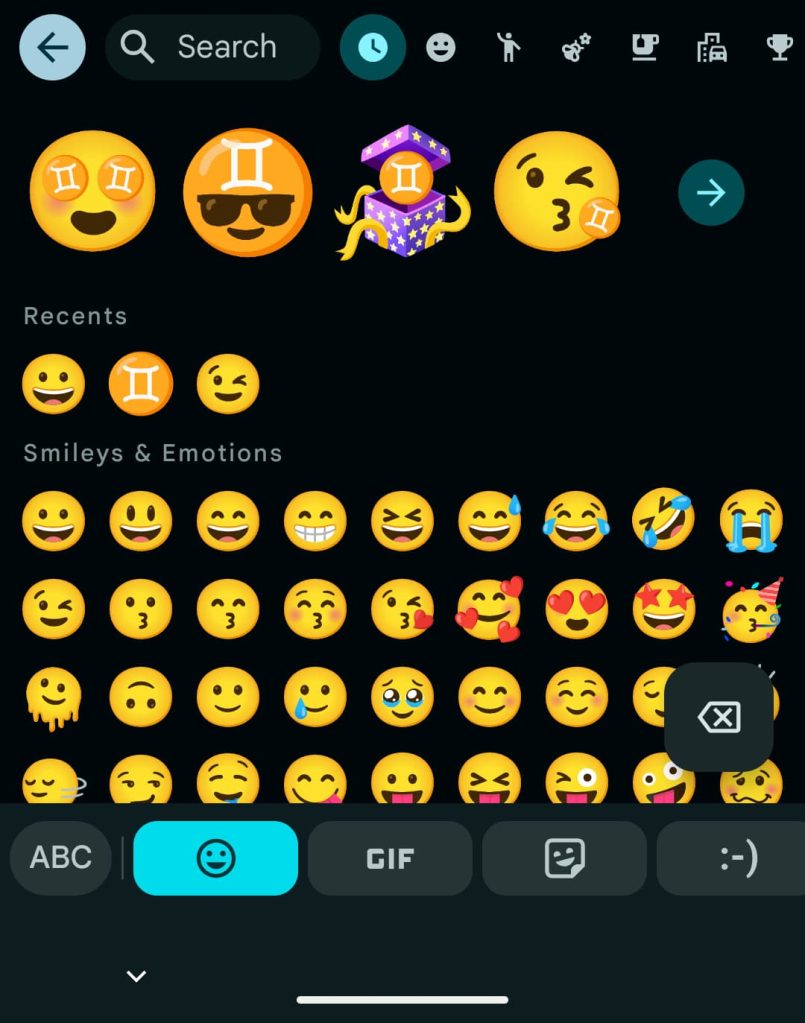
The redesign introduced a new carousel to switch between Emoji, Custom Stickers (with Pixel Studio), GIFs, Stickers, and Emoticons. Each item was placed in wide rectangular cards. With the addition of AI Stickers on Pixel phones, users had to scroll to access Emoticons.

As part of this change, the delete button at the very right was removed, and replaced with a FAB that only appeared when text was entered. Some disliked the floating action button for hiding what’s underneath.

Old vs. new

Gboard-old-emoji-picker-1a.jpg
Gboard emoji redesign tweaks


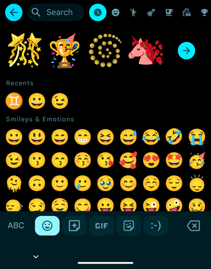
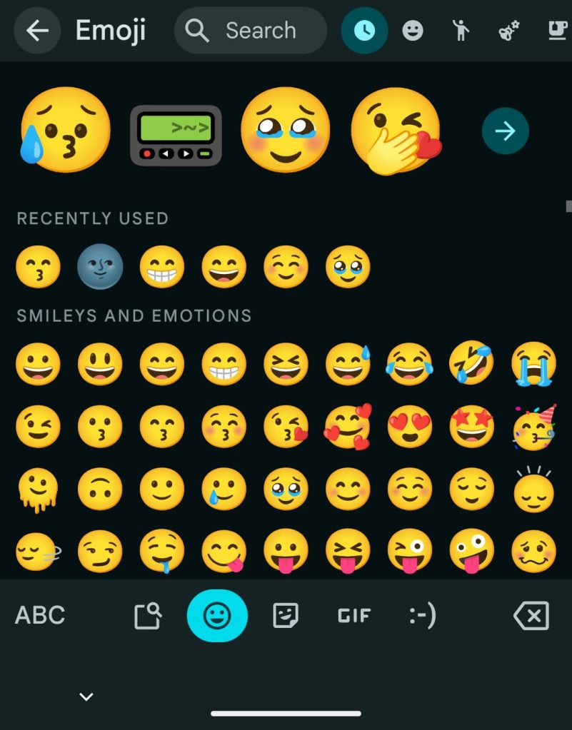
These two changes, which some were vocal about, have been reversed with the latest Gboard beta. The cards have been greatly narrowed, so that everything fits in one screen. This makes room for the delete key, while “ABC” is no longer housed in a pull. This is basically the original interface, but with rounded rectangles instead of pills.

The other changes to the top portion of the redesign are unchanged.

These tweaks to the emoji picker redesign are rolling out with beta version 15.5.7.766552071 of Gboard. It’s not yet in the stable channel, but that’s hopefully coming soon.

Original vs. latest
Gboard-old-emoji-picker-2.jpg
Gboard emoji redesign tweaks
 

limmk

High Supremacy Member
Joined
Jul 5, 2001
Messages
38,413
Reaction score
7,866


Google Photos is now rolling out an updated version of its “Ask Photos” search experience, but also a way to disable it altogether. Here’s how to turn off AI search in Google Photos.

“Ask Photos” first launched in late 2024 as an AI-powered way to navigate the depths of your Google Photos library. It had some great ideas, such as being able to search for specific events using the names of people that Photos can recognize, but it was also notoriously slow. Google ended up pausing the rollout for a while to rework the system, and that’s not available.

The updated “Ask Photos” experience in Google Photos is cleaner and faster. It shows results almost immediately, much like the legacy search, while then generating its AI results after the fact to expand on the search. It’s a good compromise on Google’s part, but it’s also still technically optional.

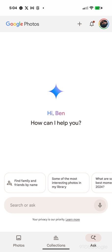
In an increasingly rare move for tech in general, Google Photos will just let you turn off AI search altogether. That is, the Gemini-integrated search. Photos has always used AI in search to some extent, but updated options let you turn off the newer stuff.

How to disable AI search features in Google Photos​

First things first, you’ll need the latest Google Photos update. Google is rolling out these options via a server-side update, meaning you just need to be on the latest Google Photos version for Android or iOS and then just wait your turn. On Android, you might be able to get the feature faster by force-closing the app.

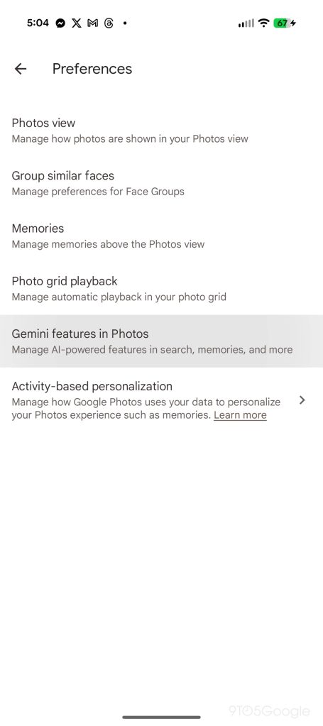
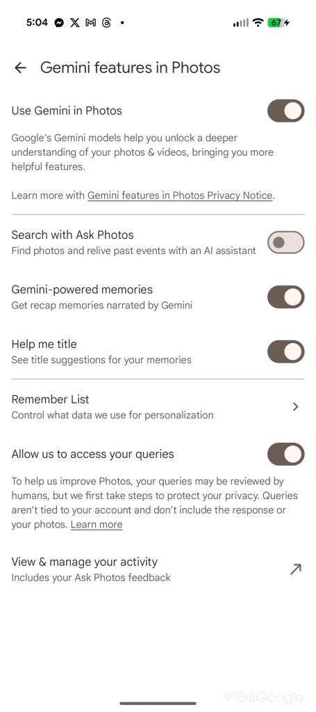
If you have the update, you’ll want to tap on your profile picture and look for “Photos settings.” On that page, tap “Preferences” and then “Gemini features in Photos.”

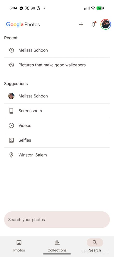
This updated section has several options within, but the one we’re specifically looking for is the toggle for “Search with Ask Photos.” Turning this setting off makes it possible to quickly and fully disable “Ask Photos.” Once flipped, the “Ask” button on the Photos bottom bar converts to “Search” and you’ll get the classic UI.

google-photos-turn-off-ai-3.jpg
google-photos-turn-off-ai-1.jpg
google-photos-turn-off-ai-2.jpg
google-photos-turn-off-ai-4.jpg


As mentioned, this is a server-side rollout that’s still ongoing, so you might not see these options just yet.
It’s certainly nice to have the choice, as the previous alternative was a relatively obscure shortcut.
 

limmk

High Supremacy Member
Joined
Jul 5, 2001
Messages
38,413
Reaction score
7,866


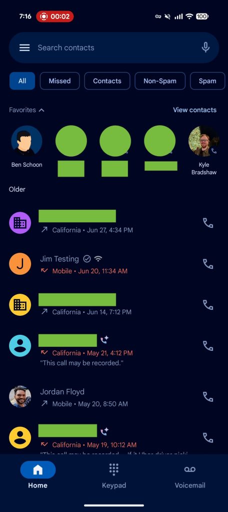
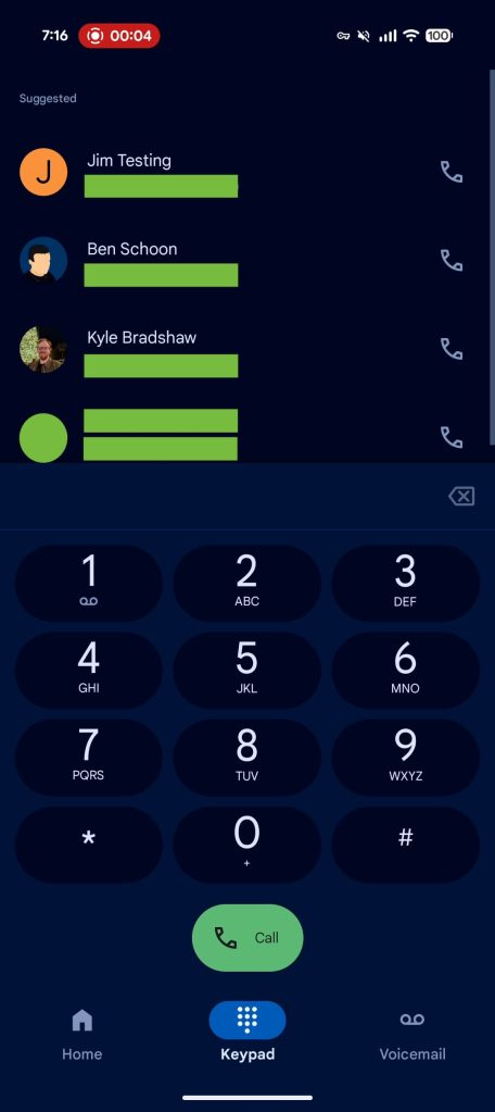
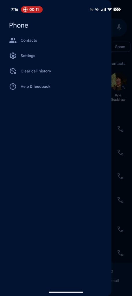
Phone by Google, like Messages, is taking a piecemeal approach to rolling out its previously announced redesign. Following the Favorites tab removal that most, if not all, Google Phone beta users got yesterday, the Home and Keypad redesign is beginning to roll out with a navigation drawer.

The Recents tab is now called “Home,” while the Favorites bar adds a prominent “View contacts” shortcut in the top-right corner.

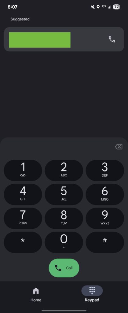
Meanwhile, Contacts is replaced by a new “Keypad” tab that replaces the FAB (floating action button). The general layout is unchanged, with a sheet for the actual number pad and “Suggested” contacts appearing at the top.

The Voicemail tab looks unchanged from the original design.


Google-Phone-Home-redesign.jpg
Google Phone Keypad redesign


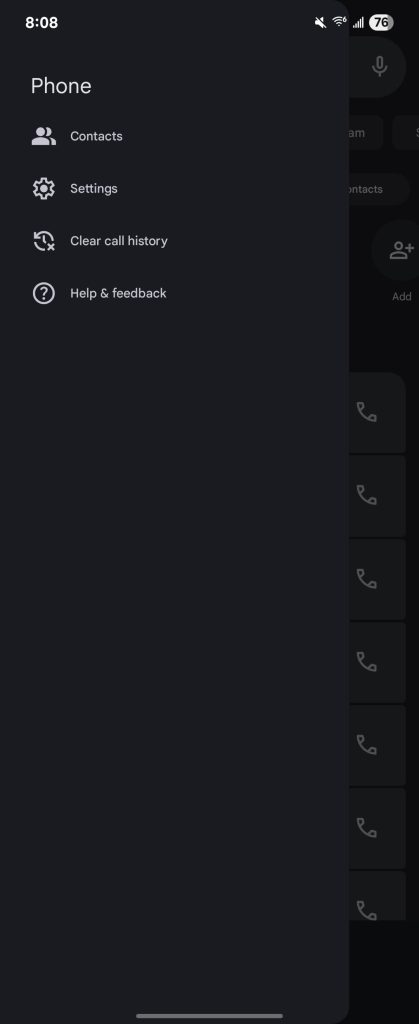
This redesign adds a navigation drawer to the Google Phone app. Featuring rounded corners at the top/bottom-right, you have access to the Contacts list, Settings, Clear call history, and Help & feedback. This replaces the three-dot overflow menu in the “Search contacts” field. The microphone button now moves to the very right, with this bar not appearing in the Keypad tab.

Notably, this Home, Keypad, and nav drawer redesign is rolling out to both Material 3 and M3 Expressive, with most Google Phone users not having the latter look yet. (That update is what brings the new incoming call gesture.) Compared to the Favorites removal, this latest round is not widely rolled out yet.

Beta version 182 started introducing these changes earlier this week.

Google-Phone-Keypad-redesign-3.jpg
Google-Phone-Keypad-redesign-4.jpg
 

limmk

High Supremacy Member
Joined
Jul 5, 2001
Messages
38,413
Reaction score
7,866
TL;DR
  • Gemini Space is an upcoming upgrade to the Pixel’s At a Glance experience.
  • It’s seemingly inspired by Samsung’s Now bar and Now Brief, which show contextual cards on the lock screen and other places.
  • In its current state, Gemini Space displays sports and birthday cards, but finance and Daily Hub features are expected in the future.


We’ve previously spotted Google working on a feature called Gemini Space for Pixel devices. Based on the handful of clues we could spot, we speculated that it could be Google’s version of Samsung’s Now Bar and Now Brief features. Now, we’ve managed to activate Gemini Space, giving you the first look at what is indeed a Now Bar-inspired upgrade to Pixel’s At a Glance experience.

Thanks to the latest Android Canary build, we could activate Gemini Space on a Pixel 9, showing us a sports card and a birthday wish for an upcoming birthday.

Gemini Space on Google Pixel 9 running Android canary Upgraded At a Glance on home screen (3)
Gemini Space on Google Pixel 9 running Android canary Upgraded At a Glance on home screen (2)
Gemini Space on Google Pixel 9 running Android canary Upgraded At a Glance on home screen (1)


Gemini Space cards will also show up on the lock screen. You can see the cards in action when using a large clock and a small clock style in these screenshots:

Gemini Space on Google Pixel 9 running Android canary Upgraded At a Glance on lock screen Small clock (2)
Gemini Space on Google Pixel 9 running Android canary Upgraded At a Glance on lock screen Small clock (1)
Gemini Space on Google Pixel 9 running Android canary Upgraded At a Glance on lock screen Large clock (1)
Gemini Space on Google Pixel 9 running Android canary Upgraded At a Glance on lock screen Large clock (2)


The cards also appear on the Always On Display, as you can see in these photos:

Gemini Space on Google Pixel 9 running Android canary Upgraded At a Glance on Always On Display Small Clock (1)
Gemini Space on Google Pixel 9 running Android canary Upgraded At a Glance on Always On Display Large Clock (2)


Gemini Space should be able to show Sports, Finance, and the newly spotted Daily Hub cards, but we haven’t gotten Finance and Daily Hub to work just yet. The feature is still a work in progress, and we expect its functionality to grow and mature as it gets closer to public release. Google hasn’t yet announced the feature, so we don’t know when it’s coming either. We’ll keep you updated when we learn more.
 

limmk

High Supremacy Member
Joined
Jul 5, 2001
Messages
38,413
Reaction score
7,866
You can now move the address bar to the top or bottom

KaRBnID.jpeg

TL;DR
  • A browser with its address bar at the bottom of the screen is a desirable layout for mobile devices.
  • Chrome on iOS got this option back in 2023, but has so far lacked it on Android.
  • Today, Google finally starts giving Android users the choice, as well.


Smartphones may be pocket-sized computers, but there are a million and one good reasons why we wouldn’t want to use the same exact apps we do on our full-sized machines. Just the very fact that we’re interacting through a touchscreen means that developers need to make some thoughtful decisions when it comes to input and usability. This week, we’re getting some long-overdue good news for Chrome users on Android, as Google’s browser finally makes an important mobile-first change.

Having the address bar where a website displays its URL up at the top of your browser window makes enough sense on a PC screen, and even since the early days of NCSA Mosaic, browsers have tended to leave them up there. But while that’s fine on desktop computers or laptops, it hasn’t been our favorite choice when it comes to smartphone displays. If you’re regularly interacting with the address bar, having it down at the much more reachable bottom edge of your screen feels like superior placement. But so far, we haven’t had that option on Android.

chrome bottom address bar 2

Google

Frustratingly, Google got the ball rolling with screen-bottom address bar placement for Chrome on smartphones with its iOS release, which has had it for well over a year now. Ever since, we’ve been patiently (and sometimes not so patiently) waiting for Google to port the same feature over to Android. Back in April, we finally saw some momentum upon reports of it starting to show up on Android, but apparently that rollout never quite got off the ground. While it’s once again taken longer than we’d like to get here, today Google finally announces that Android Chrome users are getting the option.

No one will be forced to change the way they interact with Chrome’s address bar on their phones, and if you’ve gotten fully accustomed to having it up top, you’re free to keep it there. But if you have been pining away for the option to move it down below the web page you’re viewing, that chance is finally arriving.

Google says that Android users should start seeing the choice in Chrome beginning today, though it may still be another couple of weeks before the option hits your browser. Considering how long we’ve already waited, we think we can manage a few more days.
 

limmk

High Supremacy Member
Joined
Jul 5, 2001
Messages
38,413
Reaction score
7,866


Following the announcement last month, Google Chrome is now widely rolling out the bottom address bar option on Android.

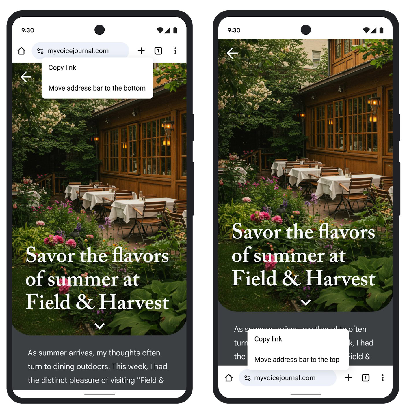
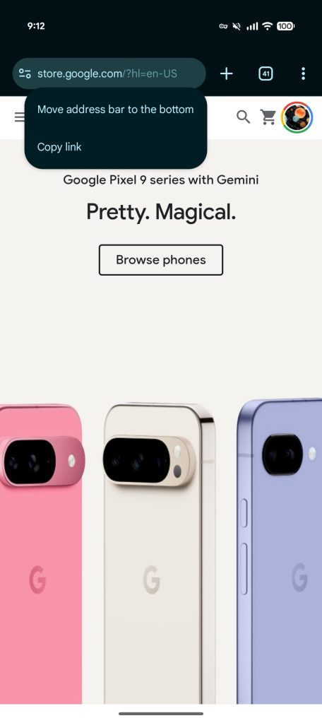
Once available, Chrome will show a “You can touch and hold to move the address bar to the bottom.” This opens a new menu to let you “Move address bar to the bottom,” while there’s now a convenient “Copy link” option. There’s also a new “Address bar” page at the top of the Chrome > Settings menu.

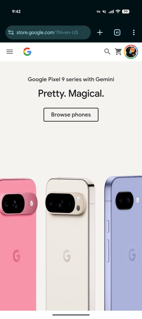
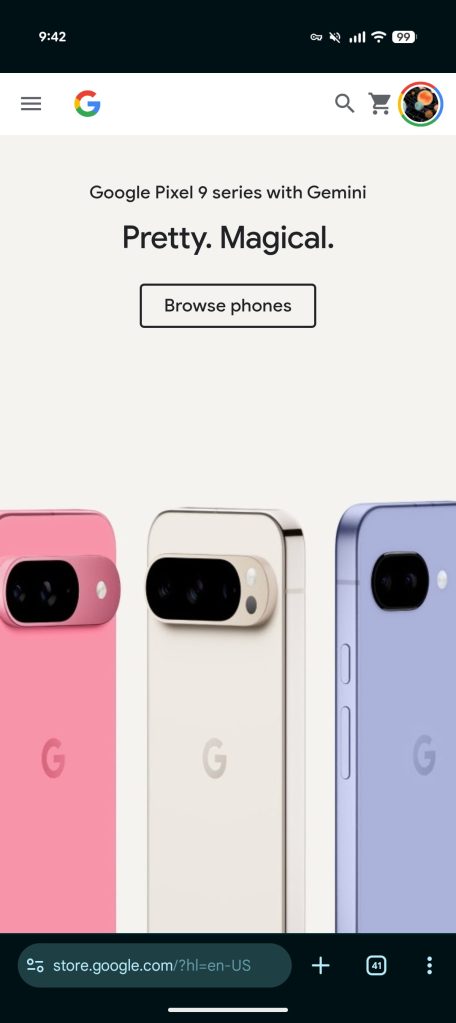
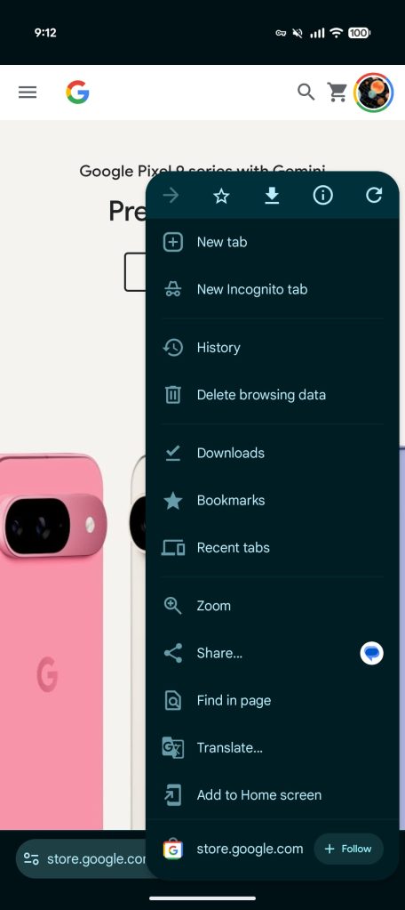
This moves the Omnibox above the gesture navigation bar for improved one-handed usage. The three-dot overflow menu is moved slightly down, but there’s no change to the order. It maintains muscle memory, but rearranging might have helped centralize common controls at the bottom. One upside, however, is how Share is pretty reachable.

Chrome Android bottom bar


A bottom address bar for Chrome on Android has been a long-time coming. It was considered around 2016 and almost launched before Google canceled the effort. Afterwards, the company tried various other designs like keeping the address bar at the top but having a toolbar at the bottom (like Safari on iOS). Ultimately, Google maintained the original look that has been around for ages with some visual modernizations over the years.

Today’s bottom address bar dates to Chrome for iOS getting the option in 2023.

Make sure you’re on version 138 of Chrome for Android. If you’re not seeing it yet, Force stop the browser from App info (you might have to do it twice).

Chrome Android bottom bar
 

limmk

High Supremacy Member
Joined
Jul 5, 2001
Messages
38,413
Reaction score
7,866
Today’s Google Messages beta introduces a small bug that has you seeing two identical icons for the Android app.

After installing beta version 20250811_03_RC00 today, you will see a pair of “Messages” icons in your app launcher. They appear side-by-side and work to launch the application with no differences between the two instances.

Amusingly, we’re seeing both icons appear in the Pixel Launcher’s app list suggestions at the top of that grid. Otherwise, if Messages is already on your homescreen, this bug will go unnoticed. It does not appear twice in search.

It’s happening on both Pixel and Samsung devices we checked today. The next beta update will presumably fix this problem, but there are no usability downsides.

Google Messages two icons

Google Messages two icons


// 9to5google
 

limmk

High Supremacy Member
Joined
Jul 5, 2001
Messages
38,413
Reaction score
7,866


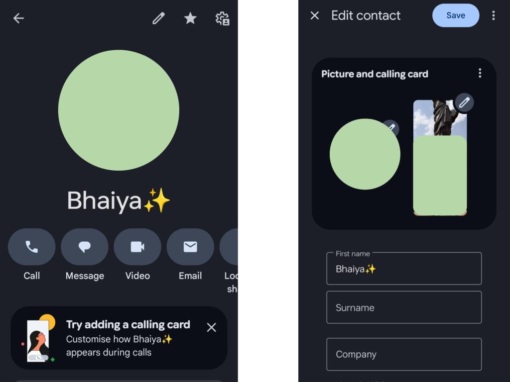
Similar to the iPhone, the Google Phone and Contacts apps are introducing customizable “calling cards” that some beta users are beginning to see.

Instead of just seeing a person’s profile picture at the center of the screen, you can have a fullscreen image serve as the background. A similar customization was introduced for the iPhone in iOS 17 (2023), but Google’s take appears to be more of an extension of profile pictures than creating something that other people will always see. That said, Google Messages lets you set what image everyone sees. Calling cards could in theory be extended to that.

Once available, opening a person’s contact page will prompt you to “Try adding a calling card: Customize how [contact name] appears during calls.” Calling cards are codenamed “patrick” in the Google Phone app.

Google-Phone-calling-card-2.jpg


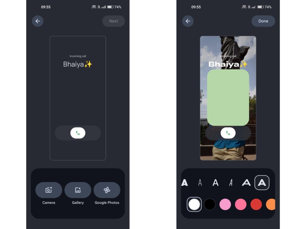
“Calling card” joins the existing circular “picture” for all other instances. After picking an image from your Camera, Gallery, or Google Photos and adjusting the position, the editor lets you pick a font and color for the name that appears near the top of the Incoming Call screen.

  • Colors: Autumn Orange, Black, Blush Pink, Dark Green, Dark Purple, Gentle Blue, Greenish Yellow, Lavender, Lavender Two, Navy, Orangy Yellow, Raspberry Pink, Red, Reddish Orange, Royal Blue, Seafoam Green, Smart Color, Vivid Cyan, White, Yellow Green, and a “Smart Color” option.
This goes hand-in-hand with the upcoming Horizontal swipe or Single tap gesture for answering calls.

Calling cards are not yet widely rolled out, but some users are beginning to see it after the Phone by Google 188 beta, while Contacts 4.61 has widely rolled out with Material 3 Expressive. In other developments, the upcoming “Call Message” capability has been renamed to “Take a Message” in the new beta.
Google-Phone-calling-card.jpg
 

limmk

High Supremacy Member
Joined
Jul 5, 2001
Messages
38,413
Reaction score
7,866


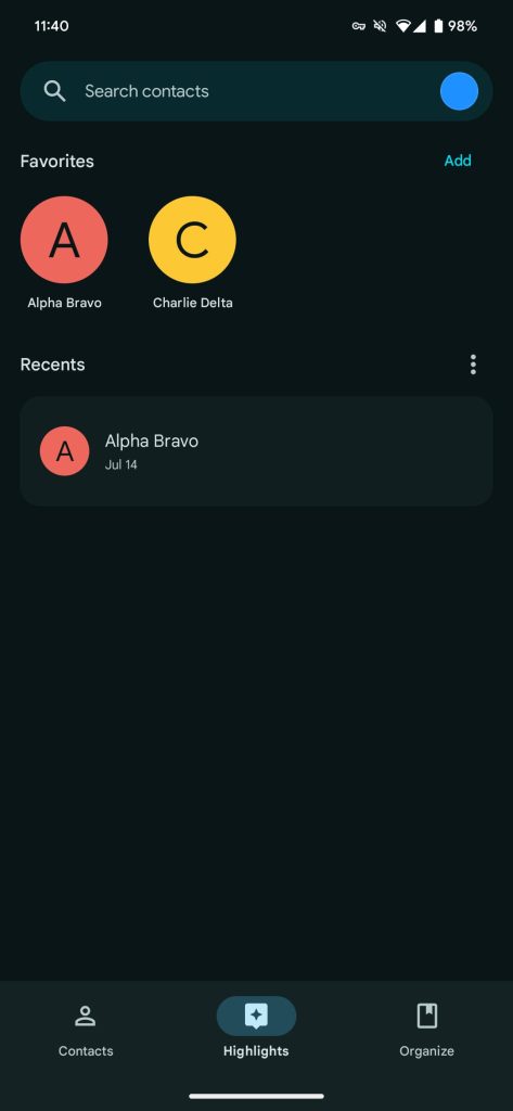
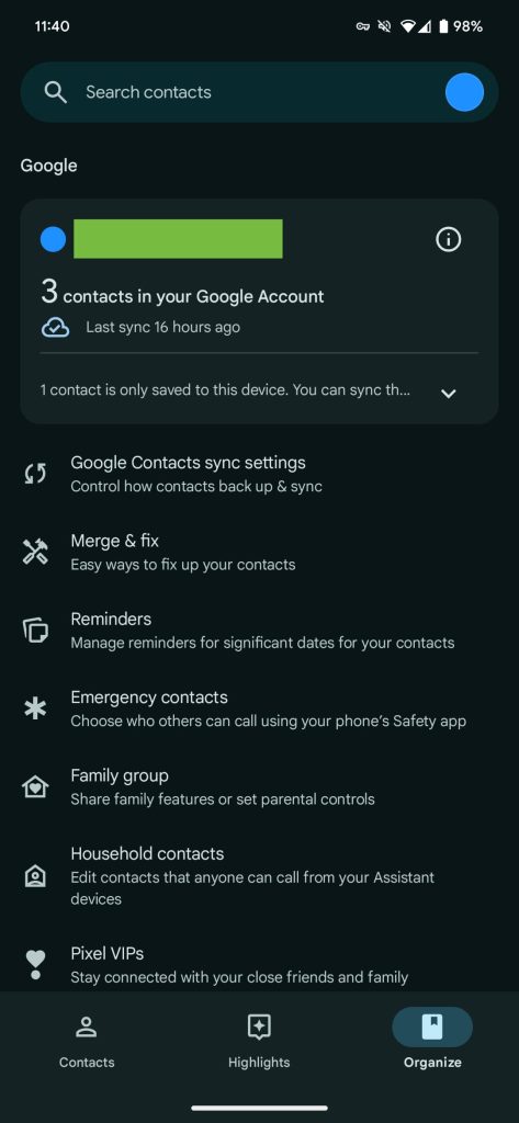
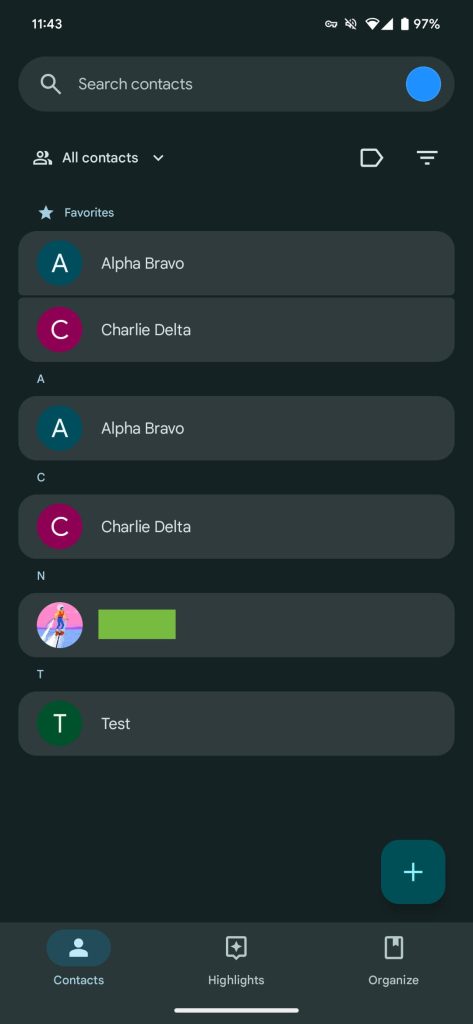
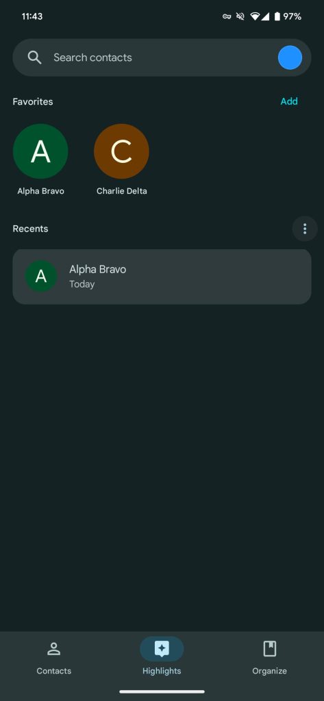
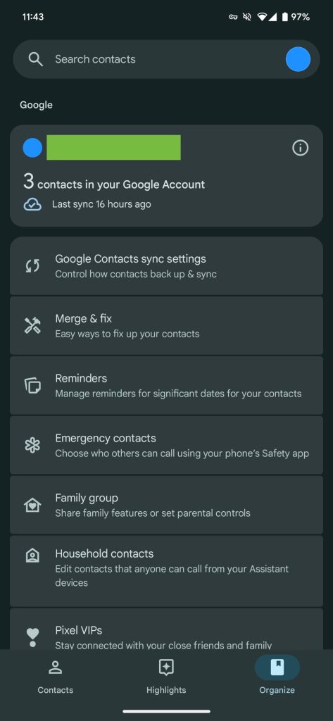
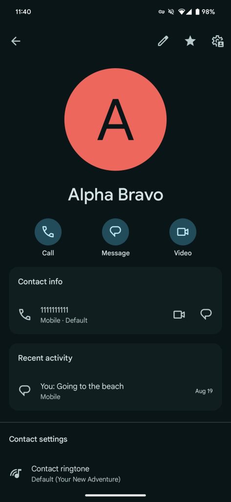
Following Messages and Phone, Google Contacts is getting Material 3 Expressive with a fairly straightforward redesign that is now widely rolling out.

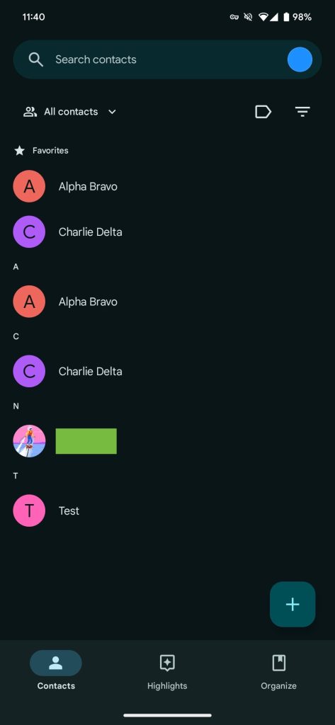
All contacts in the main tab are now placed in rounded cards for a less flat design. Besides color, the Highlights tab is mostly the same, while there are no other changes to the “Create contact” page. The various options in Organize and search results also get the same container treatment.

Old

Google-Contacts-Material-You-1.jpg

Google-Contacts-Material-You-2.jpg

Google-Contacts-Material-You-3.jpg


Meanwhile, the bottom bar is now shorter, with Google reversing Material You’s preference for taller navigation. (At the moment, the Phone app’s redesign still uses a tall bottom bar.)


New

Google Contacts Material 3 Expressive

Google Contacts Material 3 Expressive

Google Contacts Material 3 Expressive


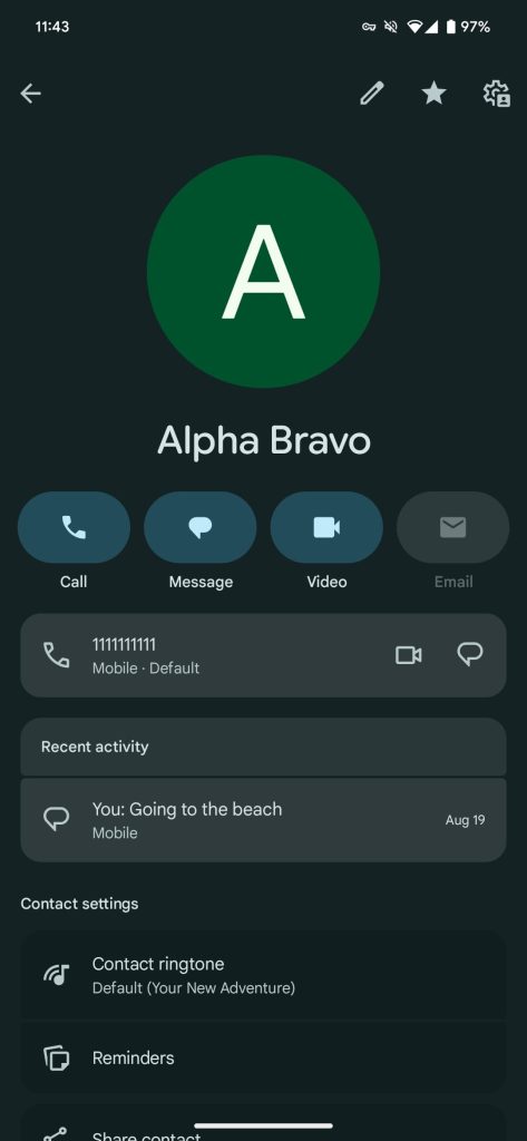
On the actual contacts page, the Call, Message, Video, Email, and Location sharing shortcuts are now pill-shaped buttons instead of circles. Containers were already leveraged here for each line, but Material 3 Expressive makes them more prominent.

Google Contacts 4.6.1.x enables Material 3 Expressive and is now widely rolling out via the Play Store. The Wear OS app is also set to get updated M3E Tiles.

Google-Contacts-Material-You-4.jpg

Google-Contacts-Material-3-Expressive-4.jpg
 

limmk

High Supremacy Member
Joined
Jul 5, 2001
Messages
38,413
Reaction score
7,866


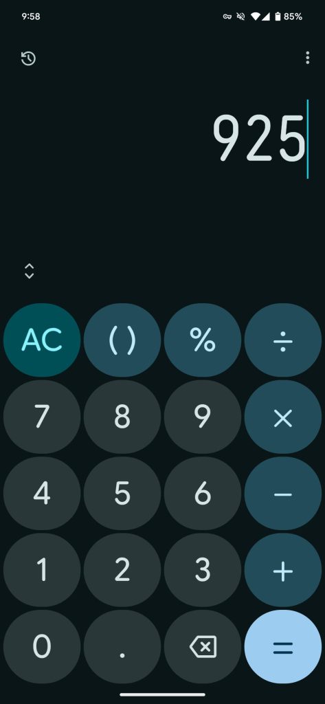
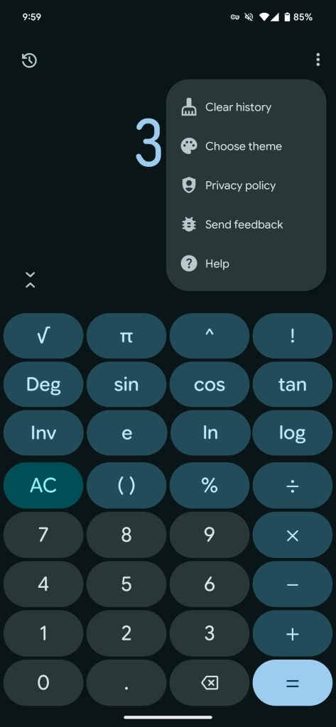
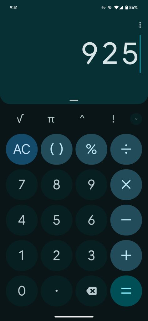
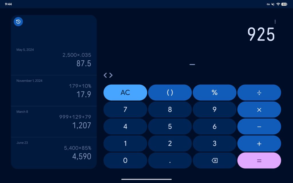
Google Calculator is getting a Material 3 Expressive redesign that moves some elements around.

Amusingly, this Material 3 Expressive update gets rid of the container that’s analogous to a physical calculator’s display. This redesign has one background that’s completely flat.

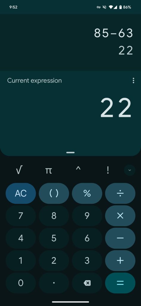
A skinnier font is used for the display numerals, and it might be an adjustment. In the top-left corner is a new button to access history, though you can still swipe down like before. This makes the tape functionality a little less hidden.

New

Google Calculator Material 3 Expressive


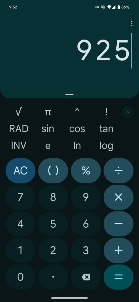
Google has removed the row of scientific actions. That functionality is now completely hidden until you tap a new expand button (two outward chevrons — they inverse to close) just above the numpad at the left. These buttons are now placed in pills and go all the way to the edge. It’s a cleaner design for most people, but those that frequently used the first four actions will dislike this removal.

There are no changes to the remaining keys below, though 0-9 have a lighter background. The three-dot overflow menu in the top-right corner has been updated to always show “Clear history,” while everything is now accompanied by icons.

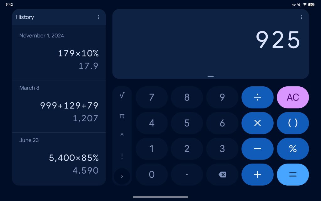
Old

Google-Calculator-Material-You-1.jpg
Google-Calculator-Material-You-2.jpg
Google-Calculator-Material-You-3.jpg


The landscape tablet layout has changed a bit, with Google now using the same layout as on phones for wider buttons.

Google Calculator 9.0 with Material 3 Expressive is rolling out now via the Play Store.

Google-Calculator-Material-3-Expressive-4.jpg
Google-Calculator-Material-You-4.jpg
 

limmk

High Supremacy Member
Joined
Jul 5, 2001
Messages
38,413
Reaction score
7,866


Following yesterday’s introduction, Google is rolling out the “My Pixel” app to replace Pixel Tips.

After updating, Google explains how “Pixel Tips is now My Pixel: Now you can get tailored tips, support and shop exclusive offers, all in one place.”

The old lightbulb icon — which had a clever/natural ’T’ filament — is replaced by what’s supposed to be a generic Pixel phone. (It looks like a Pixel 9a given the narrowness of the camera bar, but it’s definitely in the Pixel 10’s new Indigo blue color.)

My Pixel app
My Pixel app
My Pixel app


The app’s Home tab (tall bottom bar) is a series of cards and carousels, starting with a “Meet the Pixel 10 Series” promo (on our Pixel 9a). Meanwhile, the “Discover more about Pixel” section links to the Best Phones Forever videos.

The Tips tab is basically the old homepage. Google highlights the Camera and Gemini, while there’s a Get started section: The basics, Navigation, and Personalization.

My-Pixel-app-3.jpg
My-Pixel-app-6.jpg


Make the most of your Pixel links to high-level categories for: Camera, Photo & video editing, Creative tools, Communication, Notes & recordings, Music & gaming, Gemini, and Everyday tools.

Finally, there’s “Explore more tips” with: Personal Safety, Health & Wellness, Security & privacy, Accessibility, Advanced features, and Watch.

My-Pixel-app-4.jpg
My-Pixel-app-7.jpg


The Support tab shows your devices, including warranty info. Like the Google Store “Devices” page, you can see the IMEI with links to Find device, Start a repair, and Contact.

Finally, the “Store” tab is a full-blown store.google.com, but in a somewhat nicer interface. You can fully purchase products through this experience, while any products you add to your cart will be reflected on the web.

Version 7.0.73.795998032 is rolling out now via the Play Store. It’s not yet widely available.
 
Important Forum Advisory Note
This forum is moderated by volunteer moderators who will react only to members' feedback on posts. Moderators are not employees or representatives of HWZ. Forum members and moderators are responsible for their own posts.

Please refer to our Community Guidelines and Standards, Terms of Service and Member T&Cs for more information.
Top