


a562140
Supremacy Member
- Joined
- Mar 12, 2004
- Messages
- 6,412
- Reaction score
- 3
got consider the tempest commodore? saw the review on worn and wound and it looks pretty good.
was a toss up between the two and considering this colour varation (edit: not so clear in this pic but its dark green)
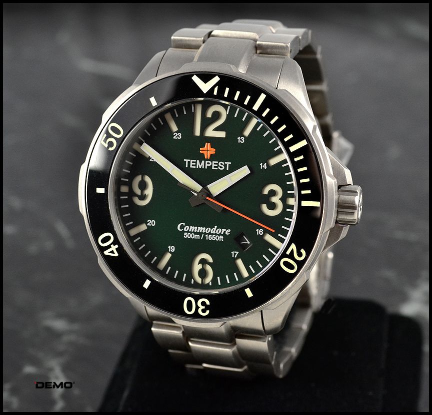
and in the end the biggest difference to me was actually quite petty: i was put off by the font used on the word "Commodore" in the dial. it looked like something that came off my work word file e.g times roman + bold + italics ... like this Commodore...but i stress it is a minor point, the quality of the watch e.g. sandwich dial, sapphire bezel and price etc... its another microbrand that challenges the mainstream brands on the concept of "swiss quality" that charges 5 times its price.
have a feeling that i'll pick this one up from the buy & sell in the future though, as I'm starting to have an itch for a green dial.
Last edited:


 ). Quite my taste, though a lot of similar looks which I prefer to spread my funds elsewhere hee hee


