Google / Android Apps New Features, Tips & Tricks

limmk

High Supremacy Member
Joined
Jul 5, 2001
Messages
43,307
Reaction score
8,365

Speed up on-device animations​

Window-animation-scale.jpg
Animation-scaling-settings.jpg


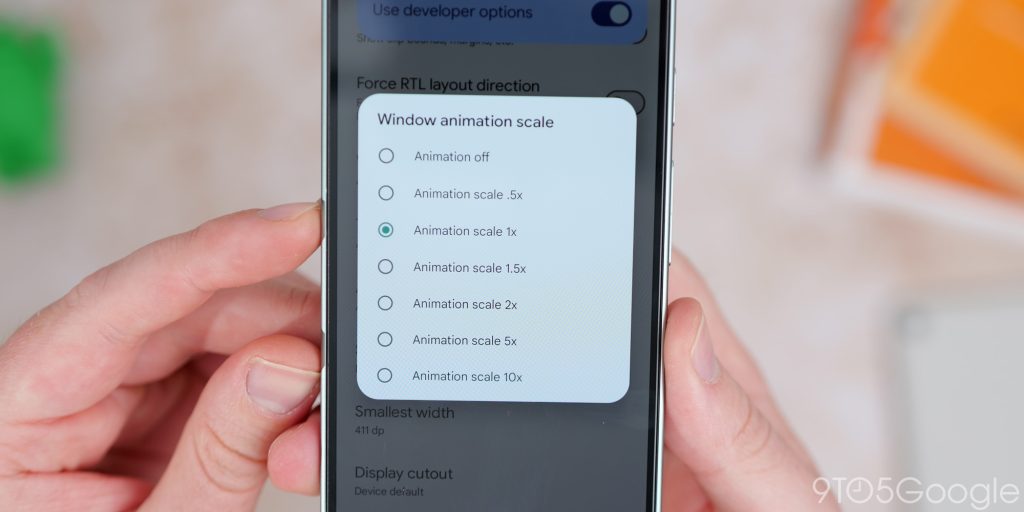
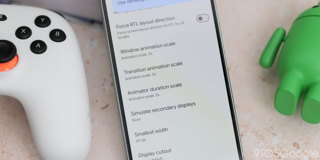
Android gets a lot of undeserved criticism for the quality and consistency of animations and perceived smoothness. In recent years, things have improved dramatically. Thanks to the enhanced developer options mode, you can tweak your phone’s animations though if they are too slow or not slow enough for your liking.

If you want to tweak animation speed, head to Settings > System > Developer options. From here, there are three options that you can toggle to improve speed. “Window animation scale,” “Transition animation scale,” and “Animator duration scale” can be tweaked to suit your own personal preferences. It’s worth noting that .5x speed means faster, so smaller numbers mean even faster animations.

Wi-Fi scan throttling​

developer options android


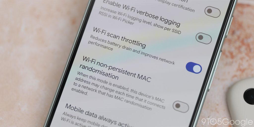
Battery life is one of the biggest complaints of any smartphone and taking steps to potentially increase it is always worthwhile — so long functionality isn’t impaired. One such function that might be worthwhile disabling is “Wi-Fi scanning.” However, you can still keep this enabled for quick Wi-Fi switching but restrict how often the scanning process takes place.

Wi-Fi scan throttling limits background apps from scanning for Wi-Fi to once every 30 minutes. Without being activated, this can be as much as once every 15 seconds. In our opinion, this is a good middle ground if you don’t want to disable Wi-Fi scanning entirely.

To enable this, head to Settings > System > Developer options > Wi-Fi scan throttling.

Force dark mode​

developer options android


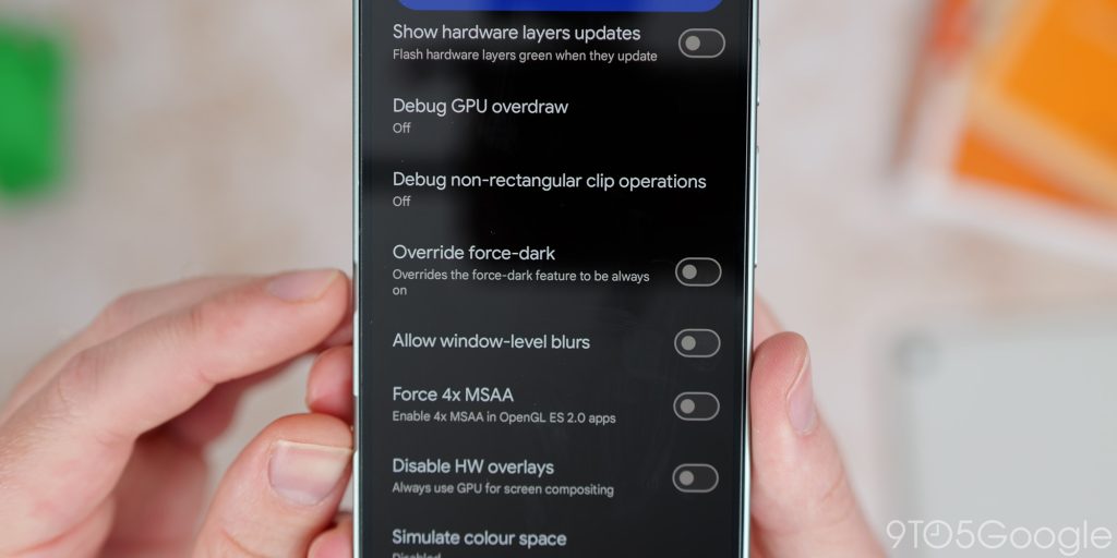
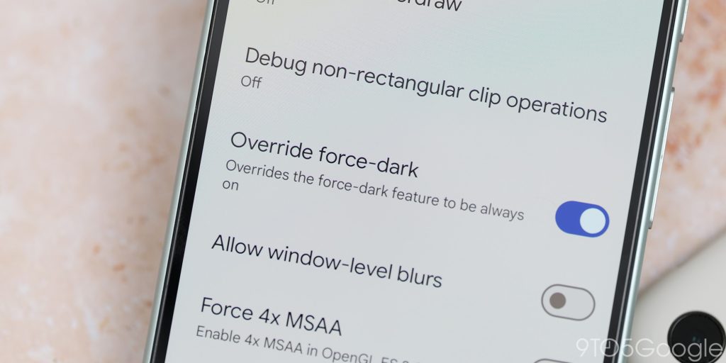
A dedicated dark theme or dark mode has been one of the best additions to Android in recent years. It still isn’t perfect, though, because even after a few years, not all apps play nicely. Thanks to a toggle found within Developer options, you can force a dark theme even for unsupported Android apps and certain system sections.

As you would expect, this can be buggy. Certain UI portions can become obscured or hard to decipher as a result of using this option. We would say use this functionality with caution as it can make some apps difficult to use properly.

If you want to enable a dark theme everywhere, head to Settings > System > Developer options > Override force-dark.

Always enable/disable mobile data​

Even when your phone is constantly connected to Wi-Fi, mobile data will be active for quick switching between networks. This is great if you are moving between networks on a regular basis, but for most people, this can affect battery longevity.

To disable or enable this function, head to Settings > System > Developer options > Mobile data always active > Toggle on/off. With this function disabled, it’s worth noting that when turning off or disconnecting from Wi-Fi, it’ll take a couple of seconds before mobile data is available, but we think this is a worthwhile compromise.

Monitor and manage running services​

developer options android


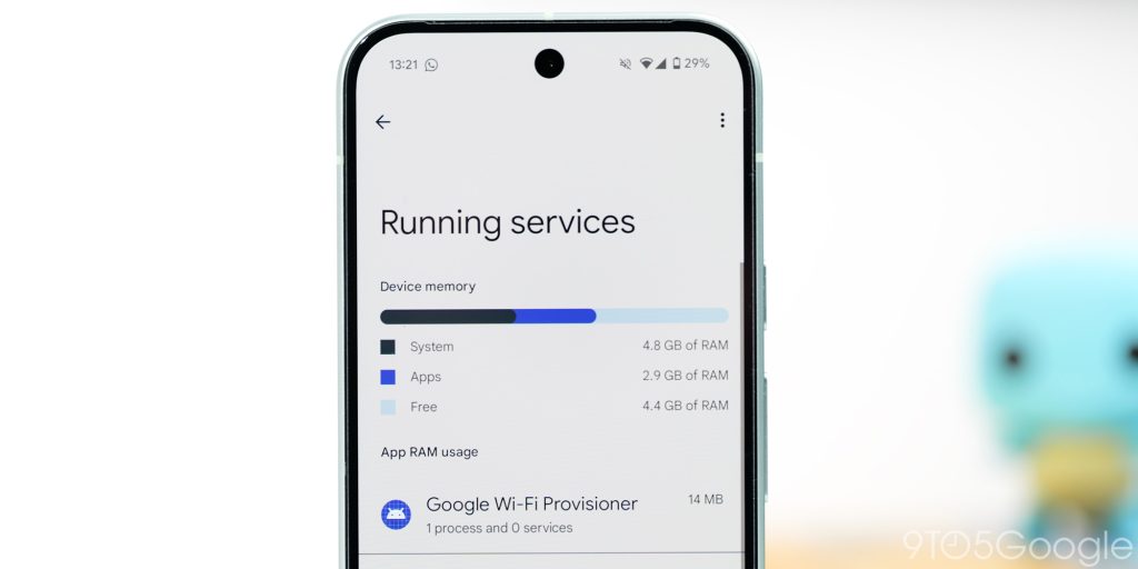
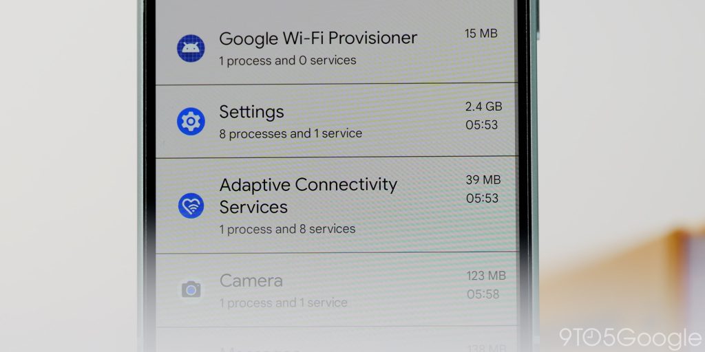
Within Developer options, you can manage and monitor any ongoing processes running on your Android phone including cached apps. If your phone is running strangely or you just want to get an idea of what is sapping at device memory, then this dashboard is a useful place to visit to get a better idea of what is going on.

You’re able to stop any processes or applications from this page, too, if you wish. Head to Settings > System > Developer options > Running services to get an idea of the current state of your Android phone.
What Android Developer options settings do you immediately enable on your device?​

We want to know just what Developer options you simply have to enable right away on your Android phone. Is there something you literally cannot live without? Let us know down in the comments section below.
 

limmk

High Supremacy Member
Joined
Jul 5, 2001
Messages
43,307
Reaction score
8,365


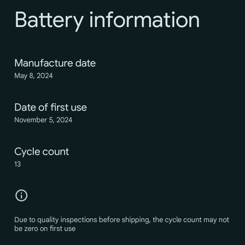
In a support article about “Understanding how your Pixel battery works,” Google has detailed how many charge cycles you can expect to get out of your Pixel phone.

Starting with the Pixel 8a, Google added Settings app > About phone > Battery information with “Cycle count” information, along with “Manufacture date” and “Date of first use.”

Pixel battery charge cycles

In the new help article, Google explains the methodology as such: “Your Pixel battery’s cycle count is the number of times the battery has completed a full discharge and recharge of the battery, including partial discharges.”

For example, if you used your Pixel from 100% charge to 50% charge and then recharged it to 100%, this would be calculated as 0.5 cycles.
Google has designed the Pixel battery to “keep at least 80% of its initial capacity up to a certain number of charge cycles”:

  • Pixel 3 and later, including Fold: Should retain up to 80% capacity for about 800 charge cycles.
  • Pixel 8a and later: Should retain up to 80% capacity for about 1000 charge cycles.
Update: Google has confirmed to us that the Pixel 8a and later should retain up to 80% capacity for about 1000 charge cycles.

For comparison, here’s what Apple says to expect from the iPhone, with similar language used: “Batteries of iPhone 14 models and earlier are designed to retain 80 percent of their original capacity at 500 complete charge cycles under ideal conditions. Batteries of iPhone 15 models are designed to retain 80 percent of their original capacity at 1000 complete charge cycles under ideal conditions.”

Google’s per device count assumes you charge as recommended. A “tip” in the article says to “Charge your Pixel phone in a cool place (about 25℃ or 78℉) with a compatible USB-C PD or PPS charger. Do not use it while it charges.”

Other provided tips to “maximize the lifespan of your Pixel battery” include:

Google recommends replacing batteries that reach the cycle charge count, or “if you notice a decrease in your phone’s runtime.”
 

limmk

High Supremacy Member
Joined
Jul 5, 2001
Messages
43,307
Reaction score
8,365


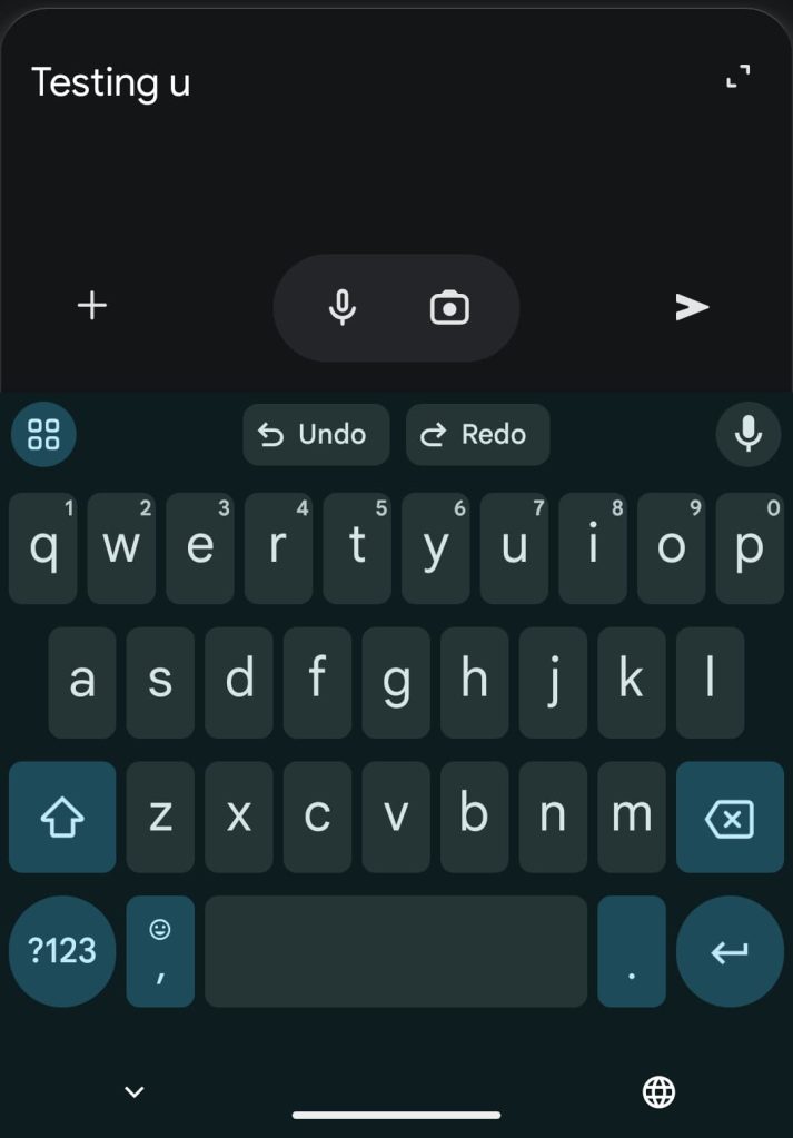
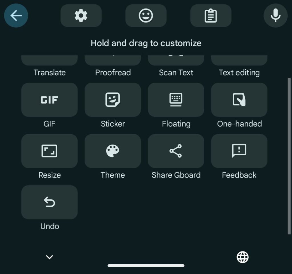
After first being spotted in development in July of 2023, the Gboard for Android beta is beginning to roll out an “Undo” button.

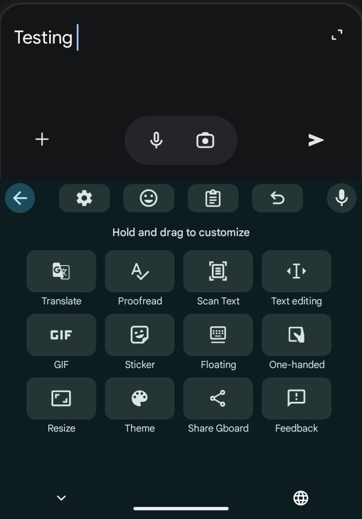
“Undo” appears as a new shortcut that you can drag up to the suggestions row for faster access.

Gboard undo


Upon tapping, Gboard will undo your last action one letter at a time, unless you deleted an entire word/sentence. At the same time, you also get “Undo” and “Redo” buttons in the strip with accompanying icons.

In brief testing, this feature appears to let you undo if you close the keyboard and open it again. However, once you exit an application, the memory is reset. When you can’t take any action, tapping the Undo key will cause the Undo/Redo chips to appear but they’ll be grayed out.

Gboard undo

Gboard undo


This functionality is quite straightforward and a very helpful addition to Gboard for Android.

We’re seeing this with version 14.9.06.x of Gboard, which is currently in beta. This is not yet widely rolled out and only appearing on one of our Android devices today.
 

limmk

High Supremacy Member
Joined
Jul 5, 2001
Messages
43,307
Reaction score
8,365


Google is kicking off a new experiment in Search Labs today called “Daily Listen.” It’s a bit like NotebookLM’s Audio Overviews, while there are also podcast parallels.

Through Discover and Search, Google is aware of what you are interested in. Daily Listen takes all that into account to create a 5 minute or so episode that provides an overview of stories and topics that you follow.

This personalized AI-powered audio experiment will appear in the “Space” carousel underneath the Search bar at the top of the Google app on Android and iOS. Tapping the Daily Listen card, which is dated and labeled “Made for you,” launches a fullscreen player.

Badged with the Gemini sparkle, Daily Listen shows a text transcript where cover art usually appears. Noting how “Generative AI is experimental,” you can give it thumbs up/down feedback.


  • Google Daily Listen
    Google Daily Listen
  • Google Daily Listen

Then there’s a scrubber with sections denoted, while controls include play/pause, 10-second rewind, next story, playback speed, and mute if you just want to read the transcript.

At the bottom, you can scroll through “Related stories” corresponding to each section with the ability to “Search for more” and thumbs up/down the interest. A docked player appears at the top of the screen as you browse.

Android and iOS users in the US can enable Daily Listen in Search Labs from the top-left corner of the Google app. The experiment is rolling out starting today. It will then take a day for the first episode to appear.

Google previously used Search Labs to test features like Notes and Talk to a Live Representative.
 

limmk

High Supremacy Member
Joined
Jul 5, 2001
Messages
43,307
Reaction score
8,365


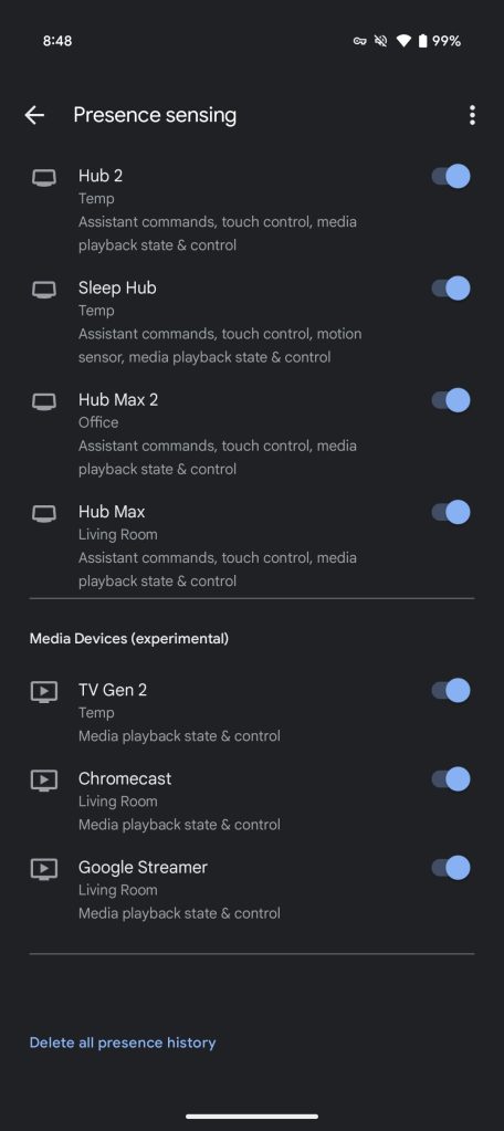
In addition to your phone, Nest smart devices, and Nest display/speakers, Google Home’s presence sensing feature, which aids Home & Away status and Routines, is now testing the ability to use “smart media devices.”

Specifically, your “media devices can contribute to presence sensing with media status, such as when they detect media playback or when you turn them on or off.” This includes:

  • Smart speakers and displays
  • TVs (including Google streaming devices)
  • Game consoles
  • Streaming sticks and boxes
Note: If presence sensing has been turned on for smart speakers and displays, they will now also contribute to media activity.

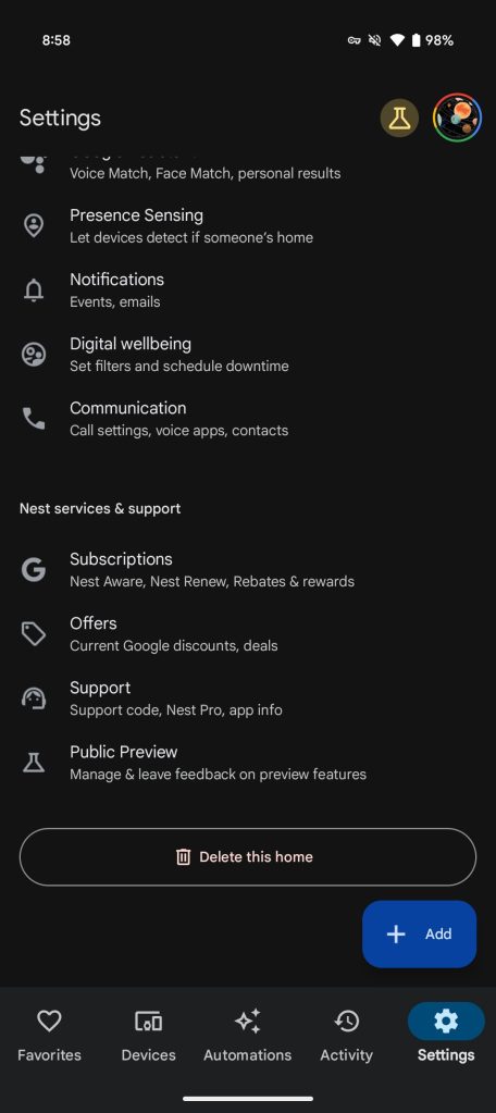
Go to the Google Home app > Settings > Presence Sensing and you’ll find a new “Media Devices (experimental)” section at the bottom after phone, Speakers, and Displays. We’re seeing Chromecast, Chromecast with Google TV, and the Google TV Streamer appear on our end.

This is currently part of the Google Home Public Preview. Other features being tested include:

Google Home presence sensing
 

limmk

High Supremacy Member
Joined
Jul 5, 2001
Messages
43,307
Reaction score
8,365

Summary​

  • Google Opinion Rewards now offers a dark theme option, following code hints last September.
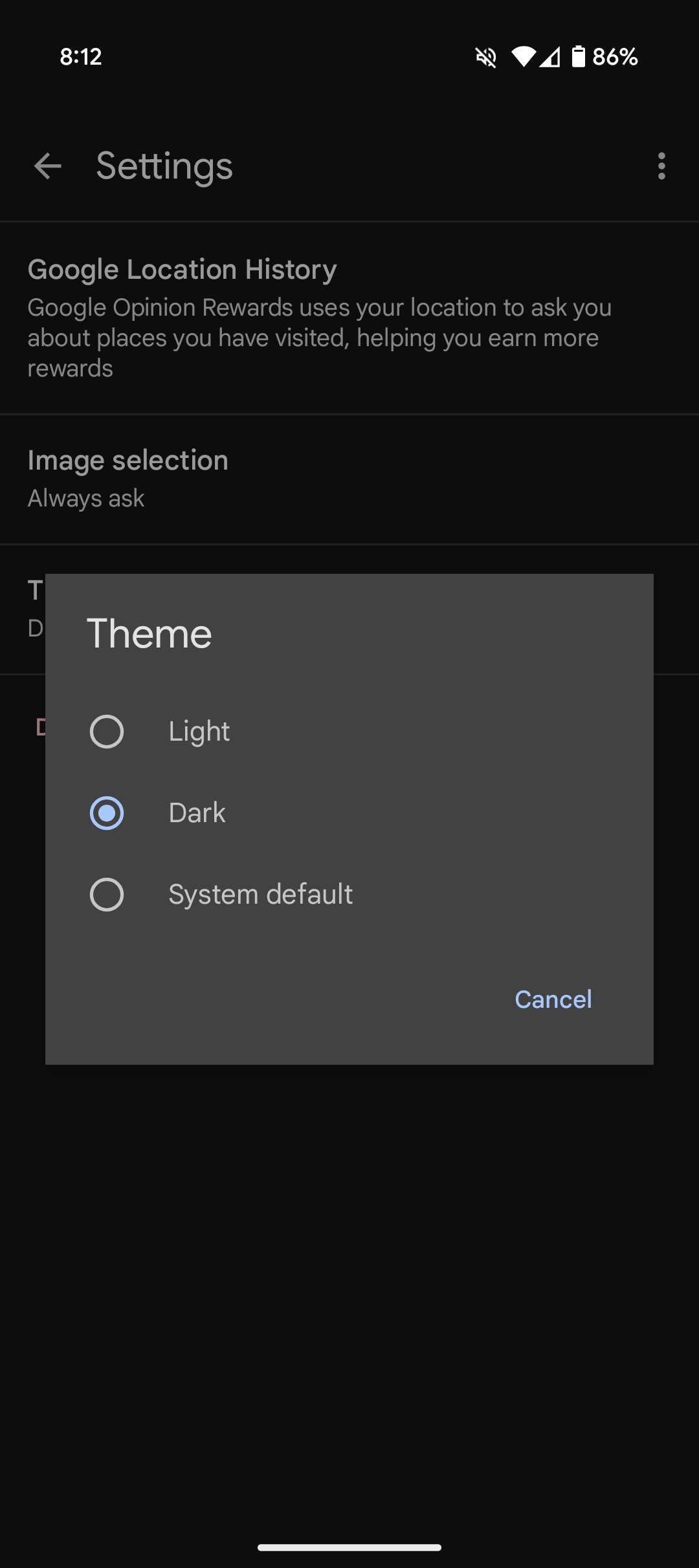
  • Users have the choice to select between light, dark, or the system default.
  • The server-side update does not appear to include significant changes beyond the new dark theme toggle.


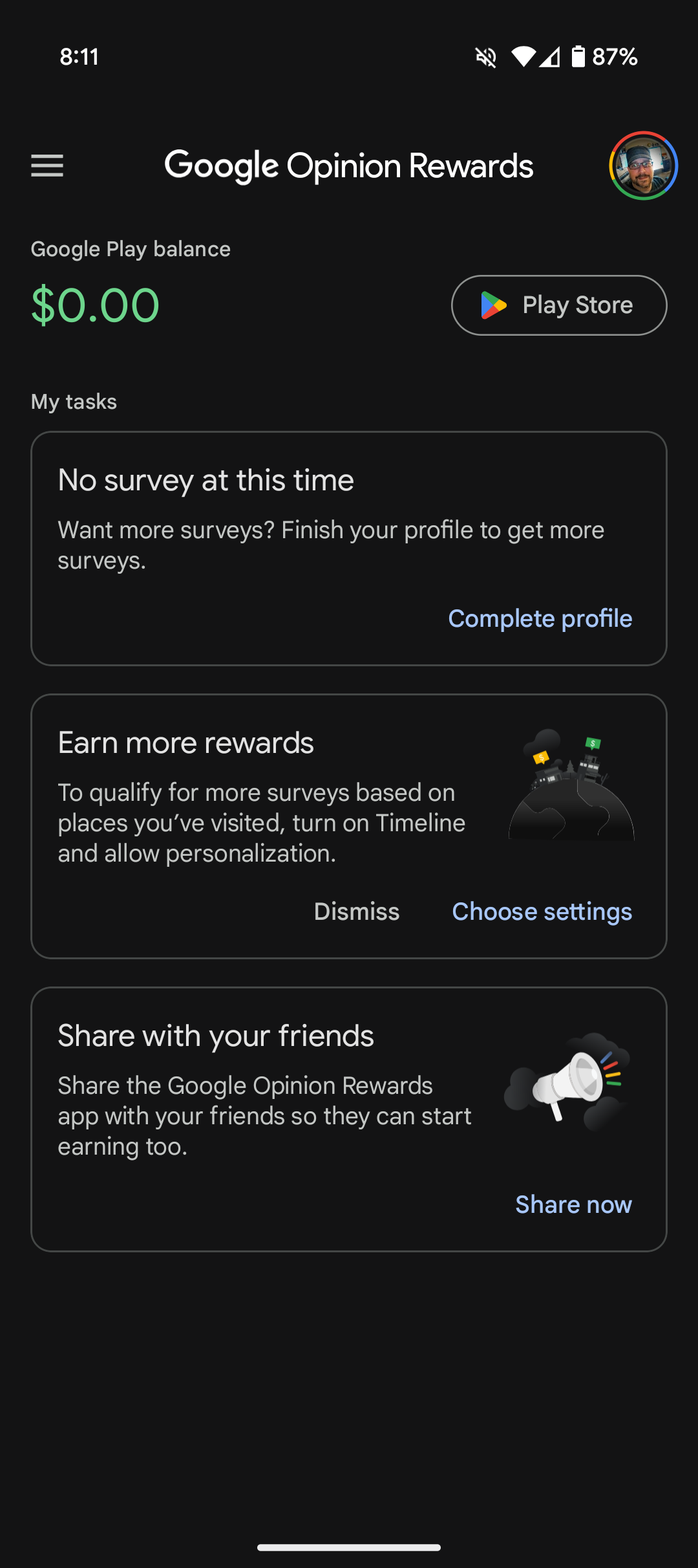
Back in September, an update to the Google Opinion Rewards application revealed some code that hinted a dark theme could be coming soon. Well, now that it's three months later, Google has indeed delivered, with a server-side update rolling out dark theme support for Opinion Rewards. It doesn't appear that much else has changed, but there is now a toggle in the app's settings to choose which theme you wish to use, light or dark, along with a third option to follow the system default.

Google Opinion Rewards' dark theme is finally here​

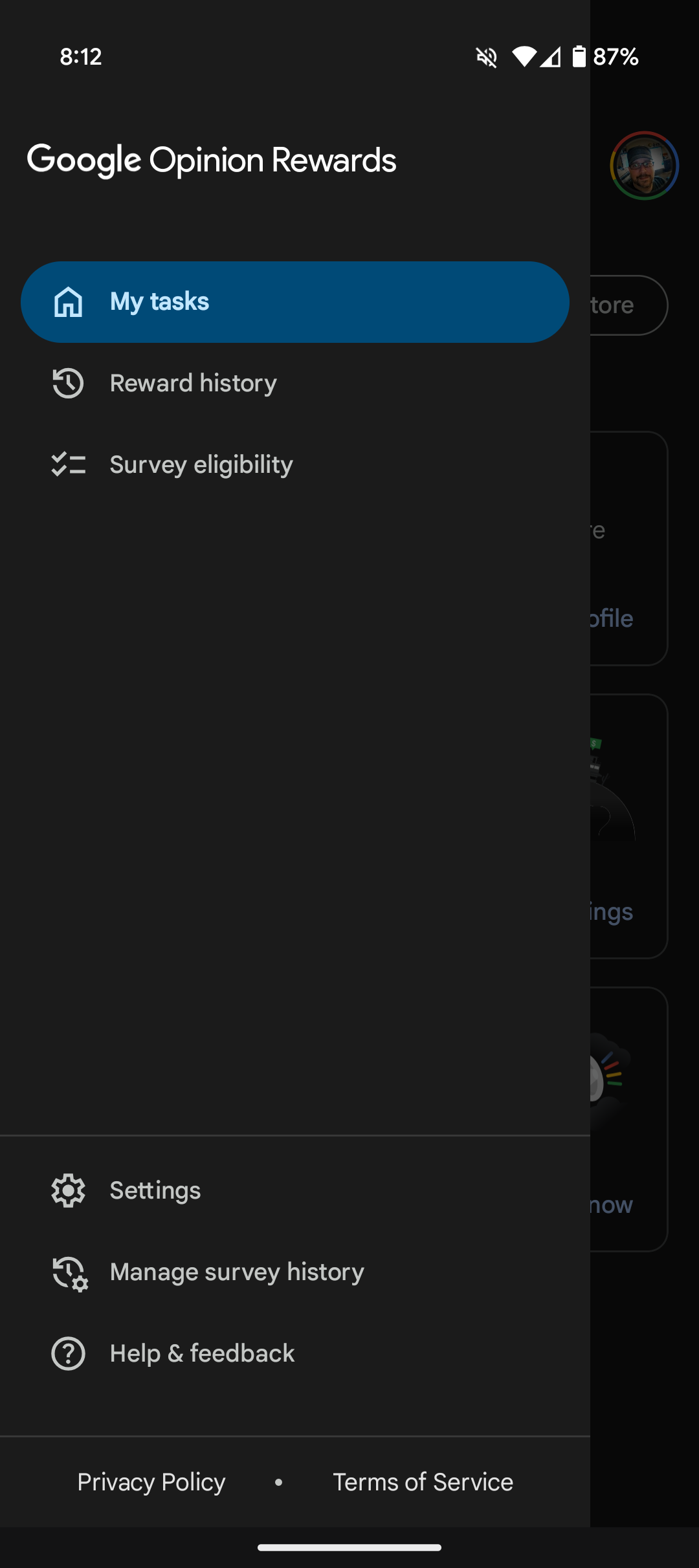
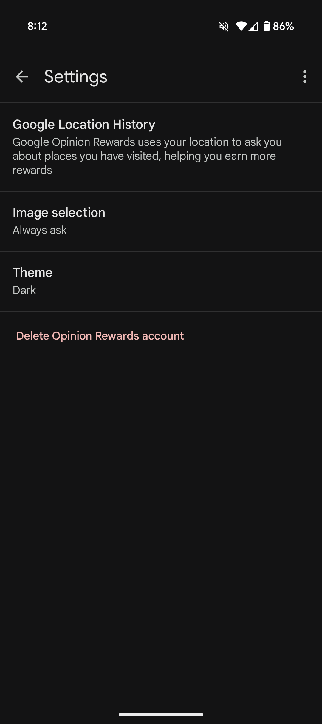
So now that Google Opinion Rewards' dark theme is here, you may be wondering how to turn it on. Well, first off, since this is a server-side update, you may not immediately see the new setting upon opening the app. I had to open mine a few times before the new setting showed. Once access is gained, the toggle is super simple to adjust. Simply click on the hamburger menu in the upper left of your screen, then click on Settings. There should be a new listing in Settings called Theme. Click on Theme, and then choose whether you want the Light, Dark, or System default theme. Easy-peasy.

Google Opinion Rewards screenshot of home screen showing dark theme
Google Opinion Rewards screenshot showing hamburger menu dark theme

Google Opinion Rewards screenshot showing the settings screen and dark theme


As you can see in the images above, the dark theme for Google Opinion Rewards looks great, and since we can set the app to follow the system default, you can easily use the light theme during the day, and the dark at night, with a bit of scheduling.

So now that dark theming has finally made its way to the Google Opinion Rewards you can easily check things out by opening the app and looking for the Theme setting. Of course, if you don't have the app installed, now is as good a time as any to remind everyone that it's a handy app to take advantage of if you'd like to fill out surveys for some quick cash that can be easily spent in the Play Store, perfect for acquiring away some funding for the next paid app or game that tickles your fancy. So, if you've yet to install the app, now that there is a dark mode, it's the best time to check it out.
 

limmk

High Supremacy Member
Joined
Jul 5, 2001
Messages
43,307
Reaction score
8,365


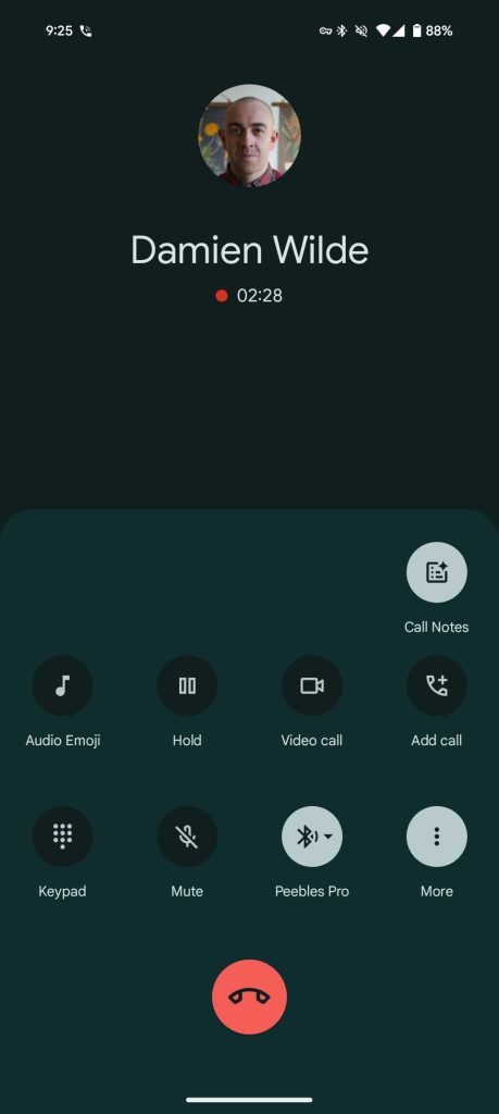
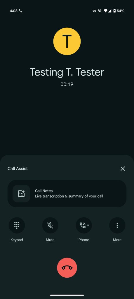
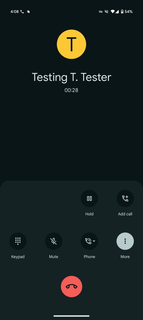
Google is rolling out a redesign of the Pixel Phone app’s in-call UI that gives more prominence to Call Notes and Audio Emoji.

At the moment, you tap “More” to access Call Notes and Audio Emoji (or the inline shortcut). Google is now showing two large pill-shaped buttons above the row for Keypad, Mute, Phone, and More.

Old vs. new

Google Pixel 9 Pro
Pixel Phone call redesign


Tapping “Call Assist” — Google’s family name for Call Screen, Direct My Call, Hold for Me, etc. — slides up a sheet with a big card to activate Call Notes. This UI allows Google to show a description: “Live transcripts & summary of your call.” There’s also a more explicit “Stop” button and other tweaks to the timer.

Save for the new bigger button, the Audio Emoji panel is unchanged today, with this design in testing since last month. If you’re not on a Pixel 9+, you’ll just get a full-width button for Audio Emoji.

As part of this change, the More menu has been simplified with those two options removed.

We’re seeing this in-call UI redesign for Pixel with version 157.0.712311883 of the Phone by Google app, which is currently in the beta channel.

Pixel Phone call redesign

Pixel-Phone-call-notes-redesign-5.jpg
 

limmk

High Supremacy Member
Joined
Jul 5, 2001
Messages
43,307
Reaction score
8,365


The first big redesign of the Gemini overlay on Android is beginning to roll out for some users.

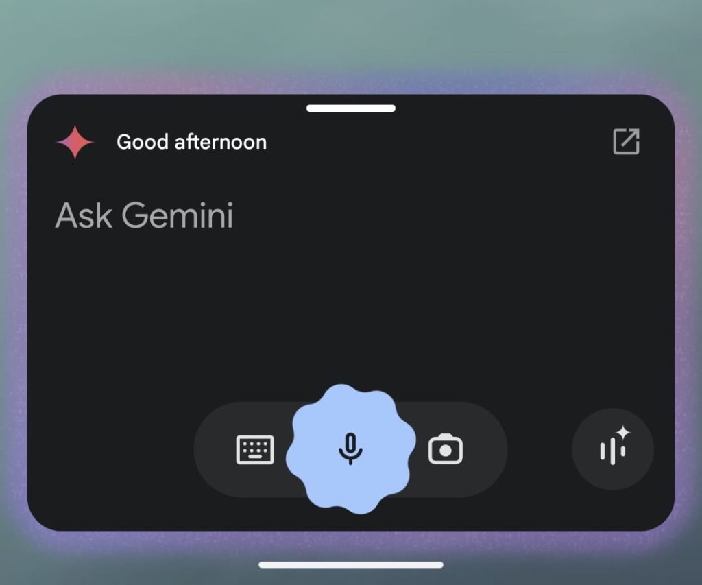
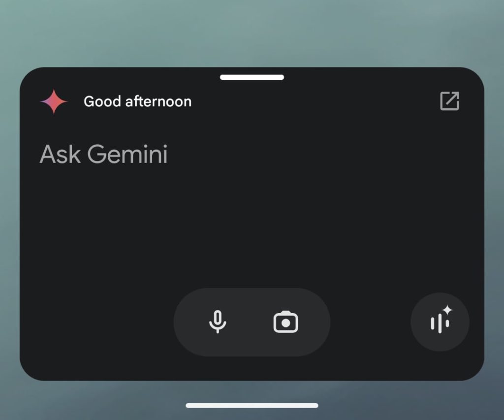
Gemini launched on Android last February. When long-pressing the power button, swiping up from the bottom corners, or saying the “Hey Google” hotword, you get a rectangle with rounded corners. The Gemini sparkle appears in the top-left corner with a greeting and shortcut to open the full app. At the bottom, you get a pill for keyboard, voice, and camera input, while Gemini Live is at the bottom-right corner.

Gemini-overlay-2024-1.jpg

Gemini-overlay-2024-2.jpg


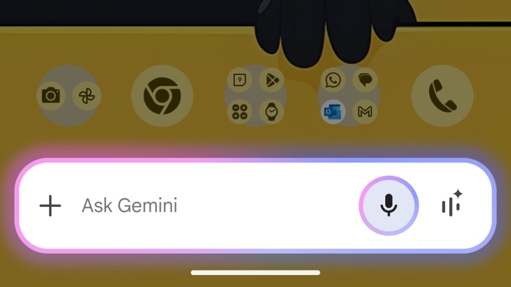
A new design shrinks everything down into a text field, and follows the Gemini app homescreen simplification in October.

Like in the full app, you get a ‘plus’ menu at the left followed by “Ask Gemini.” The voice input circle and the entire overlay are bathed in the same blue/purple glow, which is quite prominent in this new size. The Live shortcut rounds out this interface.

There are a handful of reports today about people getting Gemini overlay redesign. It’s not yet widely rolled out, and we’re not seeing it on devices we checked this afternoon.

This new overlay is quite compact, with more than a few parallels to the Google Search bar, though it isn’t pill-shaped. Overall, Gemini’s initial, pre-response UI doesn’t have to be too big.

Gemini overlay redesign

Credit: u/amitsama92


limmk

High Supremacy Member
Joined
Jul 5, 2001
Messages
43,307
Reaction score
8,365


Late last year, Google widely rolled out “profile sharing” wherein you set what name and contact photo other people see in the Messages app. This resulted in people seeing different profile images, but Google Messages is now letting you override that with “Set as chat picture.”

By default, profile sharing — previously known as “profile discovery” — replaces the locally set photo you have for a contact with their Google Account picture, which appears in the top-right corner of every first-party app and website.

People did not like this change that removed user customization, and Google has recently introduced a way to go back to the image you previously set in Google Contacts or equivalent system app on your Android phone.
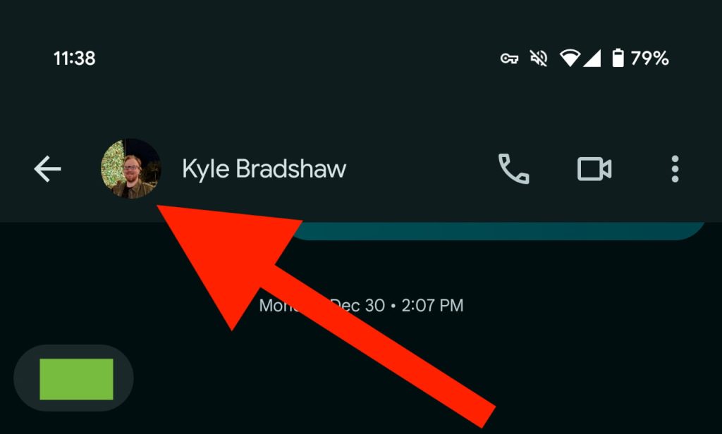
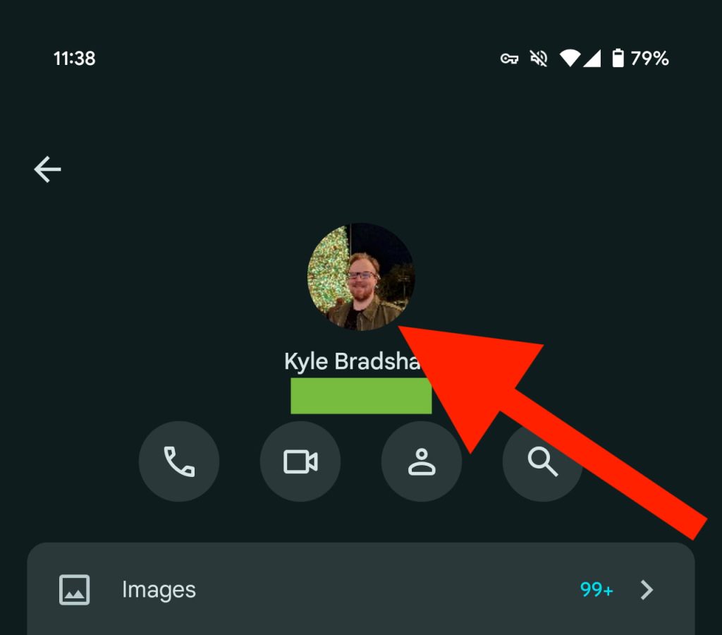
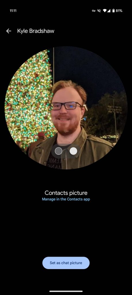
To change, tap the photo/name in the top bar so you’re on the Details page. Tap the small circular image at the top for a new interface that lets you switch between “Google profile picture” and “Contacts picture.” A convenient “Manage in the Contacts app” shortcut is available here.

Google-Messages-profile-images-set-1.jpg

Google-Messages-profile-images-set-2.jpg


Swipe to pick the one you want displayed and tap “Set as chat picture.” Your selection will appear throughout Google Messages.

Google appears to have added this option in the past month. A support article explains further about how you can “Set a local contact picture for someone in Google Messages: You can choose to display your contact’s profile picture in Google Messages. You can set a local contact picture or their shared profile picture.”


  1. Open Google Messages.
  2. Open a conversation with the contact.
  3. At the top of the conversation, tap the Contact’s name or Profile picture.
  4. On top of the details page, tap the Profile picture.
  5. To switch between the shared profile picture and your local contact photo, swipe left or right.

Custom contact photos widely rolled out in both the beta and stable (version 20241120) of Google Messages.

Google-Messages-profile-images-set-3.jpg
Google-Messages-profile-images-set-4.jpg
 

limmk

High Supremacy Member
Joined
Jul 5, 2001
Messages
43,307
Reaction score
8,365


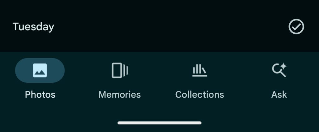
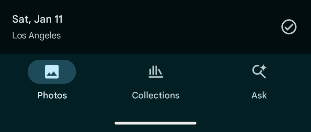
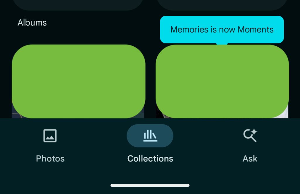
Following iOS, Google Photos for Android is simplifying the bottom bar by removing the “Memories” tab, though the auto-organizing feed — now called “Moments” — remains available.

As such, Google Photos now has a three-tab bottom bar with Photos, Collections, and Search, or the Gemini-powered “Ask.” The app does look much cleaner as a result, with other core navigation elements located in the top bar: the ‘plus’ button for “Create new” and the recently introduced “Updates” feed that replaced Sharing.

Google Photos Memories


Earlier this year, Google Maps also went down to three tabs for a nice bit of symmetry. Material You bottom bars still look fine with four tabs, but five, like in Google Home, is pushing it to my eye.

To make this change, Google Photos removed “Memories” in a de-prioritization. The “scrapbook-like” feed introduced last August that auto-categorizes pictures from the same event is now called “Moments” and can be found in the Collections tab. It now exists at the bottom alongside People & pets, Albums, Documents, and Places, with album art that cycles through recent images.

Google-Photos-Memories-Android-1.jpg


There is no change in functionality: “Your photos, organized into your best moments. Add details, search and share with others.”

As such, the “Memories” brand in Google Photos solely refers to the carousel at the top of the main grid.

This Moments redesign is rolling out to Google Photos for Android as a server-side update with version 7.11. It’s not yet widely available.

Google-Photos-Memories-Android-2.jpg
 

limmk

High Supremacy Member
Joined
Jul 5, 2001
Messages
43,307
Reaction score
8,365
TL;DR
  • Google Home has now adopted dynamic color.
  • The feature is rolling out widely today via the Play Store with version 3.28.1.6.
  • Users will have to be on the Public Preview program.


Google released its big Material You redesign on Android 12, and it expanded even further with Android 13. Thanks to Material You’s Dynamic Color, users could personalize their devices to align with the color scheme of their wallpaper. For whatever reason, Google Home has long avoided Dynamic Color, but that’s coming to an end.

Last week, Google began testing a “Dynamic color scheme” for Google Home on Android phones and tablets. As the company explained, the app “will now reflect the color scheme that you choose for your Android phone or tablet for a more consistent and personalized experience.” The rollout was made available to those who are in the Public Preview program, but not everyone was seeing the change at the time. Now it appears the update has rolled out widely via the Play Store with version 3.28.1.6.

If you are in the Public Preview, you’ll now notice that the background, bottom bar, and accent colors are different. Previously, the app featured a white or dark gray background and bottom bar with a royal blue accent. Now the background and bottom bar are tinted and features a new accent color. The device tiles have also received a refresh it appears.

This update comes not long after Google opened up its Home API preview to developers. This move allows devs to start building apps that tap into this new tool for controlling smart homes.
 

limmk

High Supremacy Member
Joined
Jul 5, 2001
Messages
43,307
Reaction score
8,365
TL;DR
  • Google Play Store is testing a new minimal design for app listings for certain core system apps.
  • These new listings show only basic information about the app and remove feedback mechanisms.
  • This could be a way to prevent review bombing of system apps that users don’t fully comprehend.


The Google Play Store is home to millions of apps, games, and other content, and Google is constantly experimenting with features and UI changes to better serve users and developers alike. Over the years, app listing pages have gained features to increase the probability of users trusting a new app and downloading it. Curiously, one recent change to the Play Store removes features from them instead of adding them. Despite the feature regression, this change to app listings could help save some apps from being unfairly review-bombed by ignorant users.

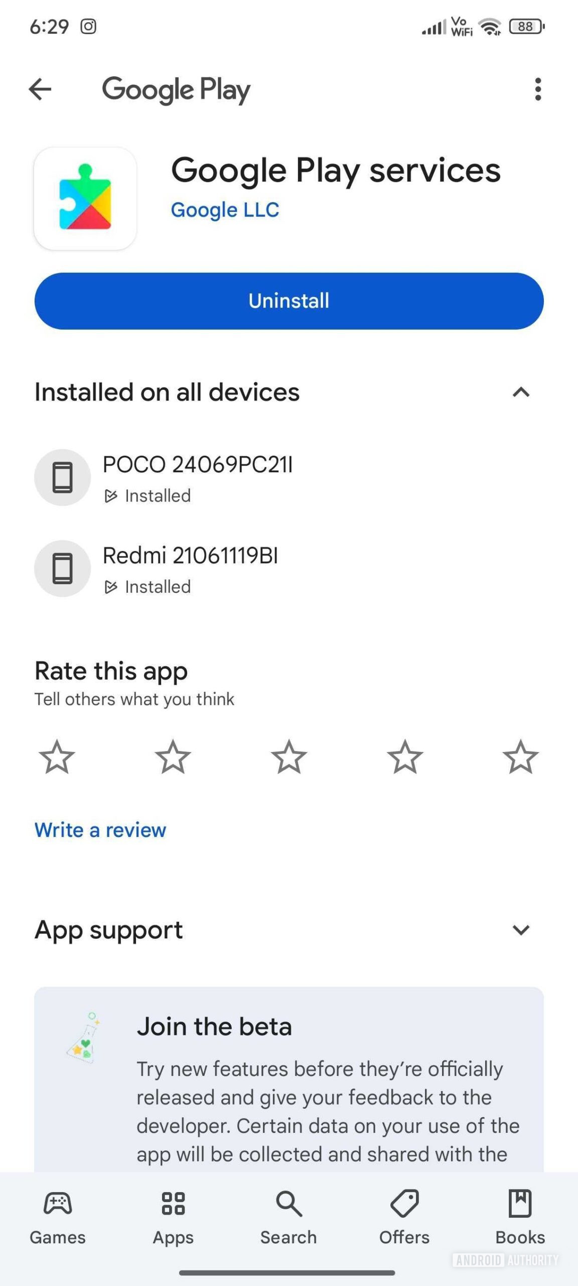
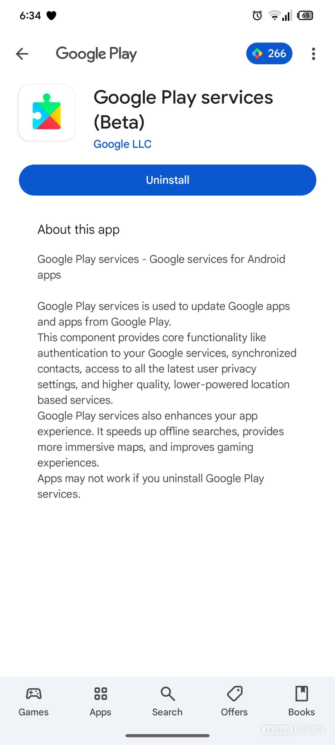
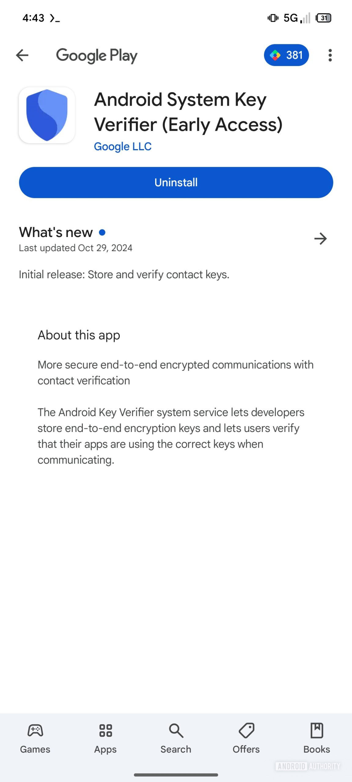
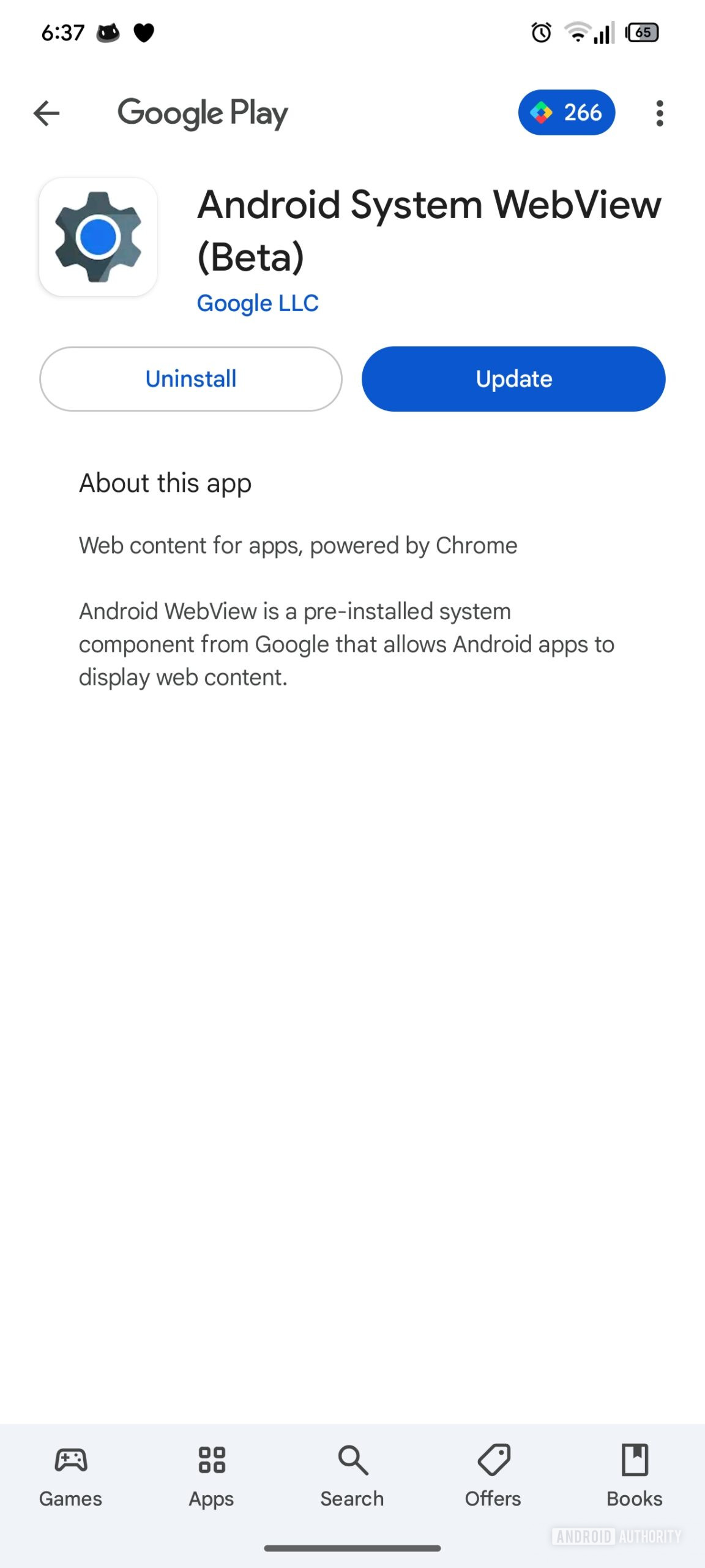
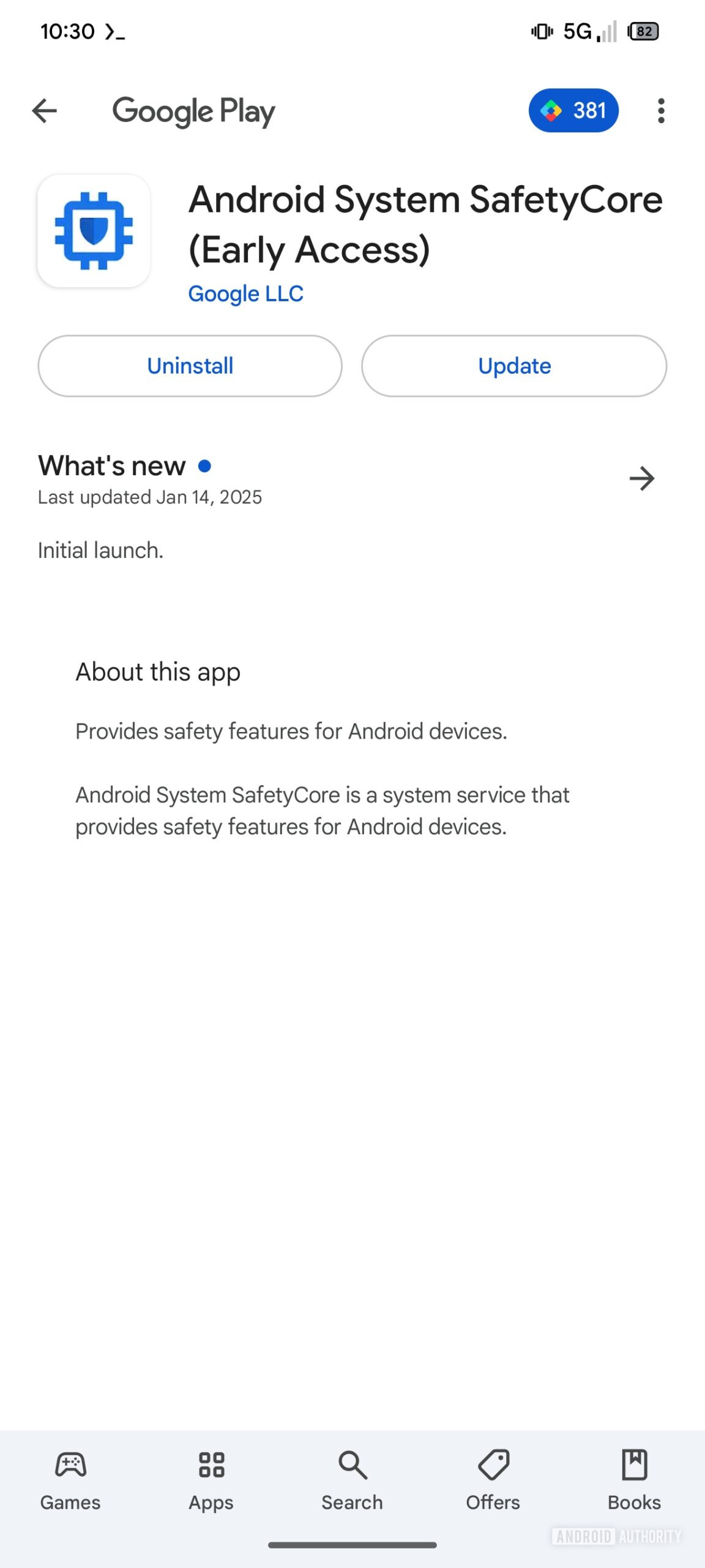
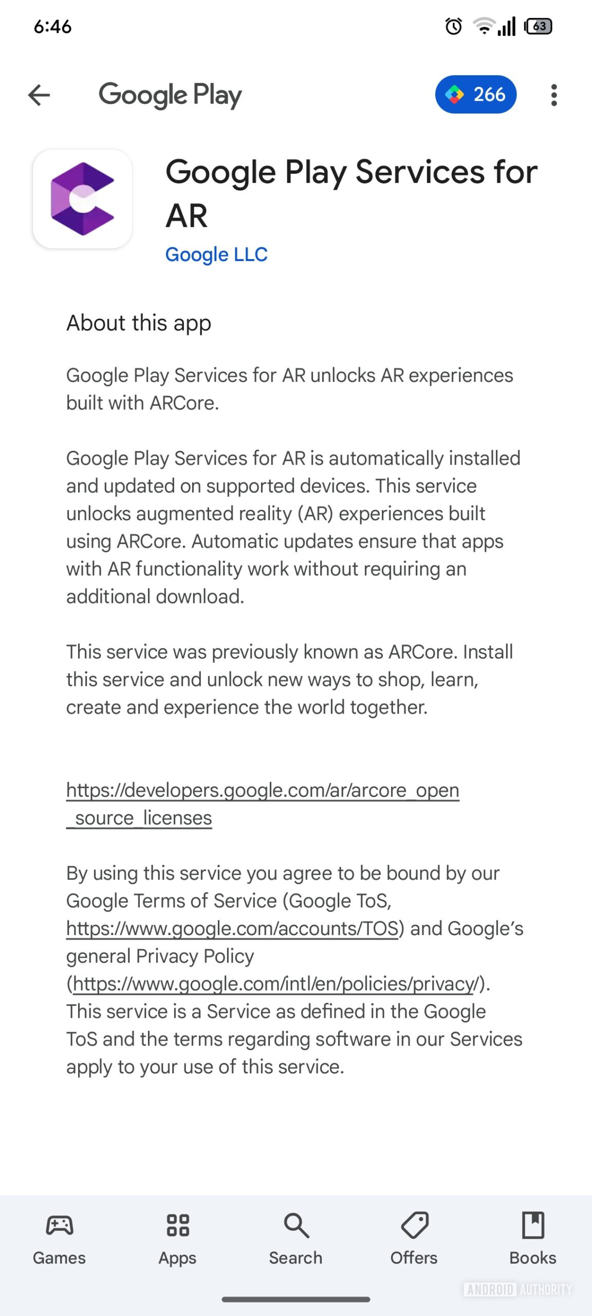
Google Play Store v44.1.17-31 brought along an interesting change: a less detailed version of the app listing pages. We managed to enable this less detailed version of app listings for several apps in the Play Store. These listing pages have practically no areas for user engagement, support, and feedback, as they merely display only a handful of details, like the name of the app and its icon, the app developer, a call to action button (“Uninstall” in most cases), and a description of the app.

Here are screenshots depicting Play Store app listing pages of Google Play Services before this change and after we activated this change:

Google Play Store Less detailed app listing pages (2)
Google Play Store Less detailed app listing pages (4)


The second screenshot shows a relatively minimal layout with merely an app description. In case an app has been updated, you will also see the changelog as provided by the app developer. These minimal listings have no reviews, ratings, app support, or carousels for similar apps.

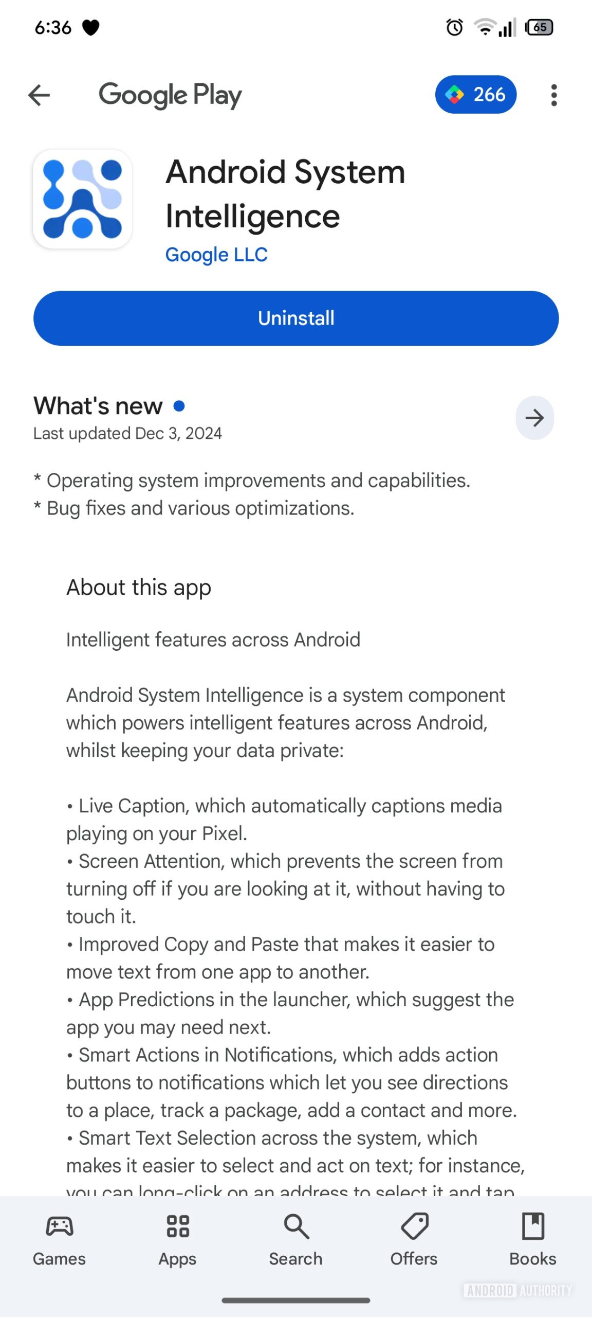
Here are some more examples of these minimal app listings on the Play Store:

Google Play Store Less detailed app listing pages (5)
Google Play Store Less detailed app listing pages
Google Play Store Less detailed app listing pages (6)
Google Play Store Less detailed app listing pages (3)
Google Play Store Less detailed app listing pages (1)


Eagle-eyed readers would have noticed that these minimal app listings are only being showcased for certain core system apps. In fact, you will not be able to land on these app listings through a search in the Play Store, as these system app listings can be accessed only through an external link such as this one for Google Play Services or in your Pending Downloads whenever there is an update available for some of these apps.

Since first spotting this change, we’ve waited a few weeks to see if Google would reverse it. The company hasn’t, so we’re inclined to believe that this is intentional.

We can only guess what Google’s intentions are for such a change, but a good guess could be that such minimal app pages for core system apps could help them avoid being review-bombed by ignorant users. We’ve noticed such behavior on some of these apps wherein users who do not fully understand the app’s purpose would leave behind 1-star ratings and negative/sarcastic reviews simply because they spotted the app on their device and hadn’t intentionally installed it. Such ignorant and unwarranted criticism often creates a feedback loop where other users also grow suspicious of such system apps. The review bombing ends up inciting a mass of users to uninstall updates to these apps, updates that could be fixing some critical bugs. So, users end up shooting themselves in the foot more often than not in such situations.

Simplifying the app details page for core system apps and having them stick to the basics sounds like a good idea for the most part. However, the other side of the coin is that the app developer could and should do a better job at describing their app, its functions, and its importance. They should educate users on why the app is present on their device and why uninstalling its updates would generally be a bad idea. Such an approach would reduce panic and mistrust; otherwise, users will simply take to badmouthing the app on social media.
 

froztheart

Supremacy Member
Joined
Aug 8, 2012
Messages
9,149
Reaction score
3,984
TL;DR
  • Google Play Store is testing a new minimal design for app listings for certain core system apps.
  • These new listings show only basic information about the app and remove feedback mechanisms.
  • This could be a way to prevent review bombing of system apps that users don’t fully comprehend.


The Google Play Store is home to millions of apps, games, and other content, and Google is constantly experimenting with features and UI changes to better serve users and developers alike. Over the years, app listing pages have gained features to increase the probability of users trusting a new app and downloading it. Curiously, one recent change to the Play Store removes features from them instead of adding them. Despite the feature regression, this change to app listings could help save some apps from being unfairly review-bombed by ignorant users.

Google Play Store v44.1.17-31 brought along an interesting change: a less detailed version of the app listing pages. We managed to enable this less detailed version of app listings for several apps in the Play Store. These listing pages have practically no areas for user engagement, support, and feedback, as they merely display only a handful of details, like the name of the app and its icon, the app developer, a call to action button (“Uninstall” in most cases), and a description of the app.

Here are screenshots depicting Play Store app listing pages of Google Play Services before this change and after we activated this change:

Google Play Store Less detailed app listing pages (2)
Google Play Store Less detailed app listing pages (4)


The second screenshot shows a relatively minimal layout with merely an app description. In case an app has been updated, you will also see the changelog as provided by the app developer. These minimal listings have no reviews, ratings, app support, or carousels for similar apps.

Here are some more examples of these minimal app listings on the Play Store:

Google Play Store Less detailed app listing pages (5)
Google Play Store Less detailed app listing pages
Google Play Store Less detailed app listing pages (6)
Google Play Store Less detailed app listing pages (3)
Google Play Store Less detailed app listing pages (1)


Eagle-eyed readers would have noticed that these minimal app listings are only being showcased for certain core system apps. In fact, you will not be able to land on these app listings through a search in the Play Store, as these system app listings can be accessed only through an external link such as this one for Google Play Services or in your Pending Downloads whenever there is an update available for some of these apps.

Since first spotting this change, we’ve waited a few weeks to see if Google would reverse it. The company hasn’t, so we’re inclined to believe that this is intentional.

We can only guess what Google’s intentions are for such a change, but a good guess could be that such minimal app pages for core system apps could help them avoid being review-bombed by ignorant users. We’ve noticed such behavior on some of these apps wherein users who do not fully understand the app’s purpose would leave behind 1-star ratings and negative/sarcastic reviews simply because they spotted the app on their device and hadn’t intentionally installed it. Such ignorant and unwarranted criticism often creates a feedback loop where other users also grow suspicious of such system apps. The review bombing ends up inciting a mass of users to uninstall updates to these apps, updates that could be fixing some critical bugs. So, users end up shooting themselves in the foot more often than not in such situations.

Simplifying the app details page for core system apps and having them stick to the basics sounds like a good idea for the most part. However, the other side of the coin is that the app developer could and should do a better job at describing their app, its functions, and its importance. They should educate users on why the app is present on their device and why uninstalling its updates would generally be a bad idea. Such an approach would reduce panic and mistrust; otherwise, users will simply take to badmouthing the app on social media.

Well, stupidity can't be cured. So Google has to implement feature regression. :s13:
 

limmk

High Supremacy Member
Joined
Jul 5, 2001
Messages
43,307
Reaction score
8,365
TL;DR
  • Google is working on a new feature to alert users when their earbuds case is fully charged.
  • New strings related to the upcoming feature suggest it could work with all Fast Pair-enabled earbuds.


Android already has a feature that notifies you when your Fast Pair-enabled earbuds and charging case are running low on battery. Google is now working on a similar feature that will let you know when your earbuds are fully charged.

Late last year, Google rolled out a handy feature for Pixel Watch users that pushes a notification when a connected watch reaches 100% charge. New strings spotted in a teardown of Google Play Services version 25.03.32 beta suggest that the company could soon bring similar functionality to Fast Pair-enabled earbuds, alerting users when their charging case is fully charged.

Code
Copy Text<string name="fast_pair_headset_case_fully_charged_title">Fully charged • %1$s</string>

The feature is still a work in progress, and we couldn’t enable it in the current release. However, it’s safe to assume it will function like the fully charged notification for the Pixel Watch. Users should see a notification on their phones when their earbuds charging case reaches 100% charge, and the notification should disappear automatically once the case is disconnected from the charger.

It’s worth pointing out that since Google is implementing this feature through Play Services, it should work with all Fast Pair-enabled earbuds and not just the company’s Pixel Buds lineup. In the case of the Pixel Watch, the company implemented the fully charged notification through the Google Pixel Watch app, making it exclusive to its smartwatch lineup. We’ll have to wait until the rollout for confirmation, though.
 
Important Forum Advisory Note
This forum is moderated by volunteer moderators who will react only to members' feedback on posts. Moderators are not employees or representatives of HWZ Forums. Forum members and moderators are responsible for their own posts. Please refer to our Community Guidelines and Standards and Terms and Conditions for more information.
Top